Implementing a Shopify checkout page might look like a simple task, isn’t it? But understanding the gravity of losing a customer from a conversion standpoint must definitely concern you about conversion rate optimization on the checkout page.
Giving a hard time to a customer on the Shopify checkout is like never expecting them back again. You may consider “they are gone”. Though it might sound too harsh, it indeed is a reality from a shopper’s perspective which puts you in a place to consider the website conversion rate optimization on Shopify checkout page more seriously.
The importance of a smooth checkout process in ecommerce
Over 17% of US shoppers abandon the cart stating that the checkout process is too complicated or long to complete. In other words, a simplified checkout process leads to fewer cart abandonments and cross-selling and upselling opportunities at this stage through an optimized Shopify payment flow can encourage customers to spend more, thereby increasing the average order value (AOV).
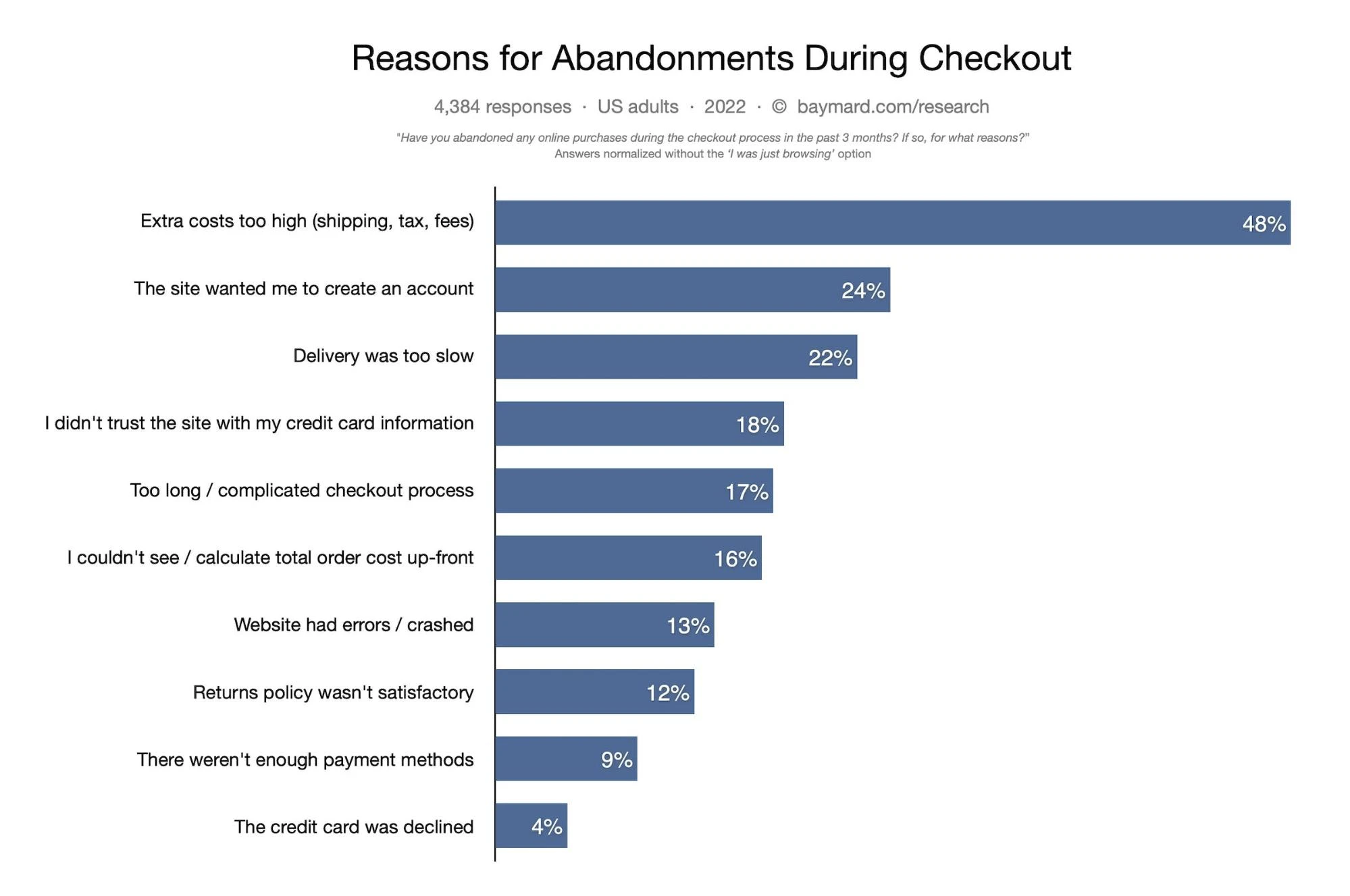
Considering the average global cart abandonment rate sits at 69%, even when shoppers go as far as the checkout page, it doesn’t guarantee sales. Since a lot can happen from the time a visitor lands on the checkout page to make a purchase, it becomes important to optimize your ecommerce checkout process to reduce cart abandonment.
What makes a great Shopify checkout experience?
The straightforward answer is, it must have a user interface such that it meets the user’s expectations with a seamless experience.
To know what makes a great Shopify checkout experience, keep reading. We show you in the next section the elements of a successful checkout page, Shopify checkout best practices, and examples of DTC and Ecommerce brands nailing ecommerce checkout pages.
14 Best Practices to optimize your ecommerce Shopify checkout page
If you have decided to simplify the checkout process and incorporate the ecommerce CRO (Conversion Rate Optimization) marketing strategy, then we’ve researched strategies to answer your question: “How to optimize the checkout page“.
1) Introduce a Shopify checkout progress bar on the page
Imagine being on an endless journey without knowing how much more there is to travel. Sounds frustrating, right? The same applies to the checkout process.
By introducing a progress bar, you let your customers know the steps involved and where they are in the process. It not only gives them an overview of the checkout journey but also eases their mind, keeping them from feeling overwhelmed.
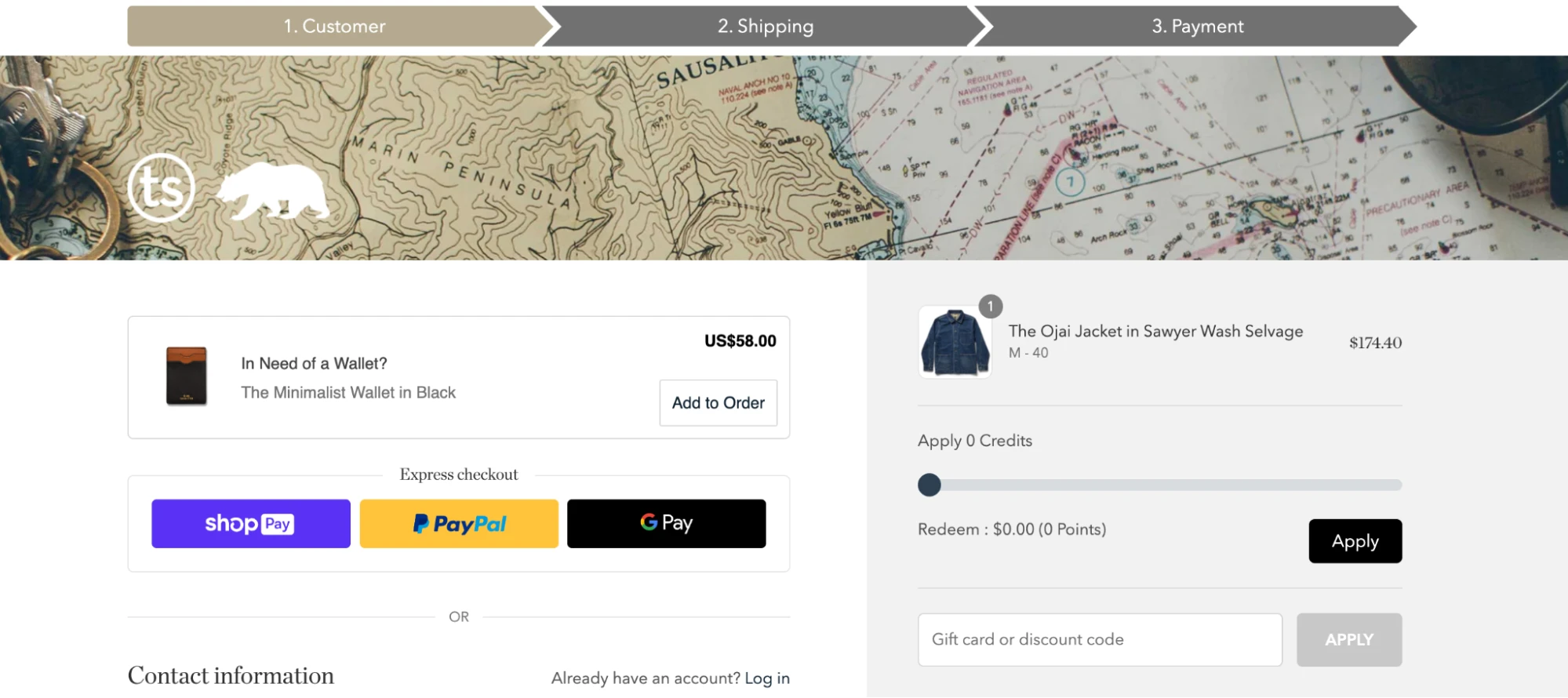
Men’s clothing brand Taylor Switch uses the Shopify checkout progress bar as a visual aid to guide customers through the different stages of the checkout process. It’s a key element of creating a user-friendly experience, ensuring shoppers are aware of what’s next and how close they are to completing their purchase.
2) Add a guest checkout but also collect customer information
Not every customer wants to go through the process of creating an account for a quick purchase. And it’s completely justified. However, while offering a guest checkout option, it’s also important to strategically collect customer information.
You might ask, “But, how do we achieve both?” To answer this question, let’s take the example of ecommerce lifestyle retailer Urban Outfitters.
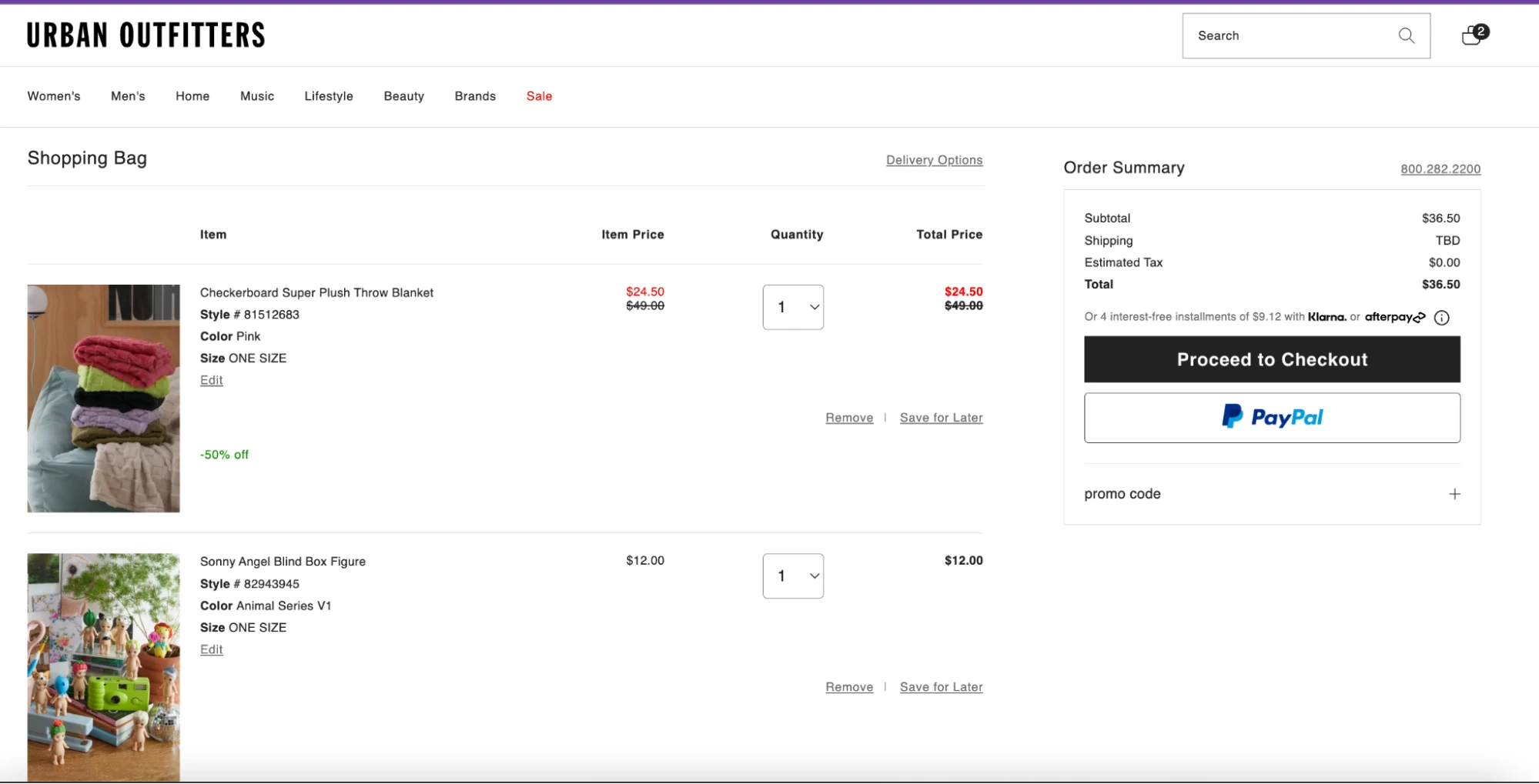
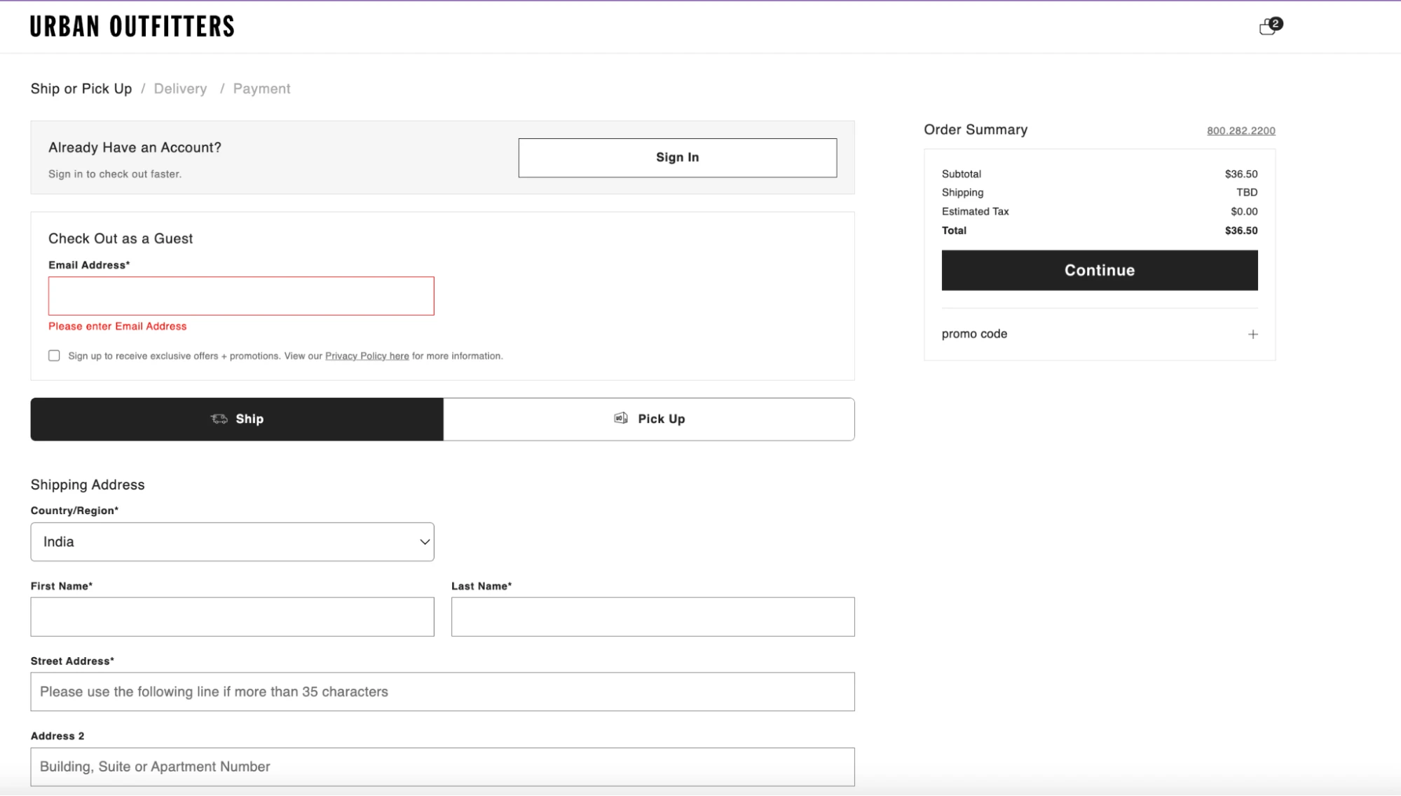
The checkout page has a simple yet intelligent design. The checkout as a guest box encourages the buyer to enter an email address to receive exclusive offers and promotions.
What’s more, on the Shopify checkout page consider offering to save their details for future transactions, which effectively creates an account less explicitly.
Remember, the trick here is not to make account creation mandatory, but convenient.
3) Using auto-fill in the checkout form
We live in an era of instant gratification and convenience, where every extra step during checkout can lead to potential checkout abandonment. Using an auto-fill can accelerate the checkout journey, minimize manual errors, and most importantly, keep customers engaged till the final click.
It’s quite easy to implement too. Modern browsers support this feature and with Shopify’s support, the data can be recalled with a simple click. This way, your customers can breeze through the Shopify checkout process, saving their time and increasing your conversion rates.
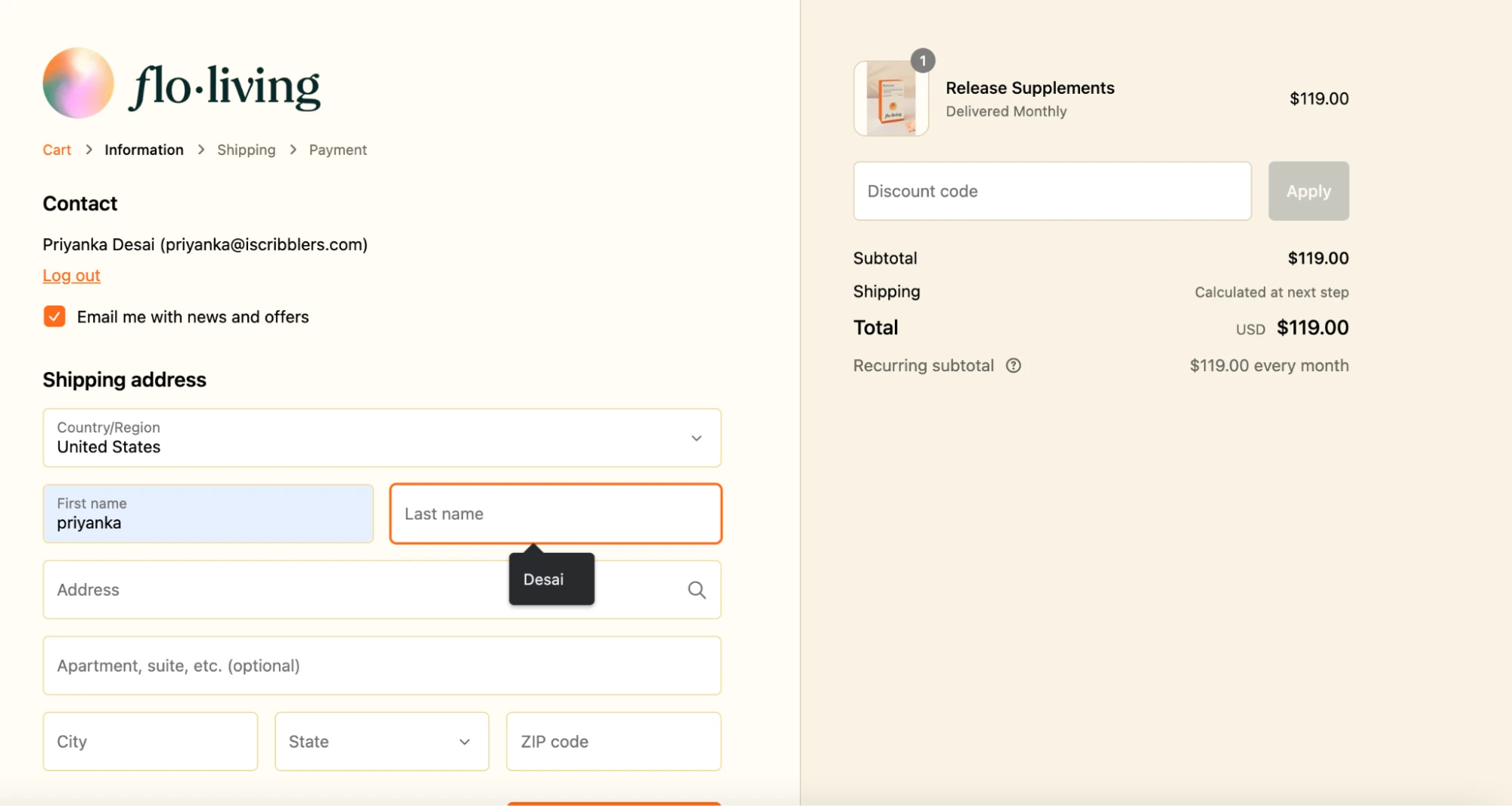
Flo living, a DTC brand for hormonal healing and menstrual cycle tracking is one such example with auto-filling capabilities
4) Single Page Checkout
While designing the checkout experience we tend to think that the buyers would want all possible information while entering their payment details to make the purchase. In reality, nobody wants to jump through countless hoops to buy what they want, and several Ecommerce conversion rate optimization studies prove this.
Getting rid of unnecessary elements is the intent behind a single-page checkout. Single-page checkout combines all the elements of the process – shipping details, billing information, and confirmation into one comprehensive, clutter-free page. The goal? A streamlined, hassle-free journey for your customers. It’s about creating a sleek, streamlined Shopify checkout journey from browsing to buying.
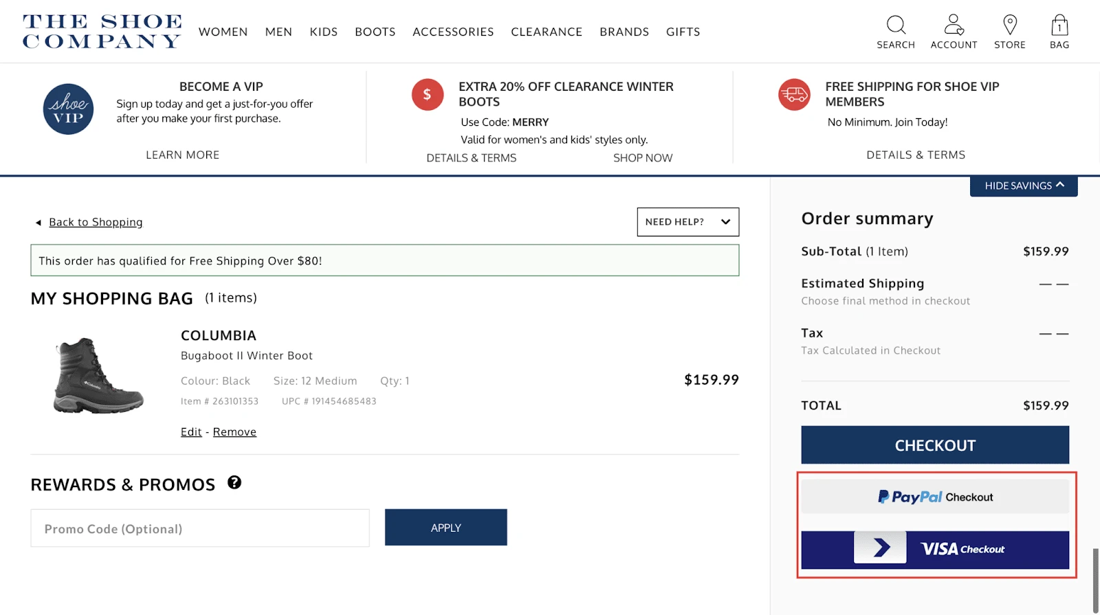
A case in point is the single page offered by The Shoe Company. It has order review, PayPal checkout, and promo codes that make their single page complete faster.
5) Use Shopify’s cart abandonment recovery feature
We’ve all been there, you add items to your cart, you’re all excited about the purchase, and then, something distracts you.
Result? A deserted shopping cart.
Now here’s where Shopify steps in with its innovative feature – the Cart Abandonment Recovery. It works like a charm, reminding customers of their forgotten carts and enticing them to complete the purchase. A gentle nudge in the right direction, if you will.
Shopify sends an automated email to remind customers about their incomplete purchases. This feature is a life-saver in terms of reviving potential lost sales.
Instead of waving a heavy goodbye to your potential buyers, help them cross the finish line by addressing their concerns and assisting them by reaching out to them via personalized emails. It’s more than just a reminder, entice them back with a tempting discount or free shipping!
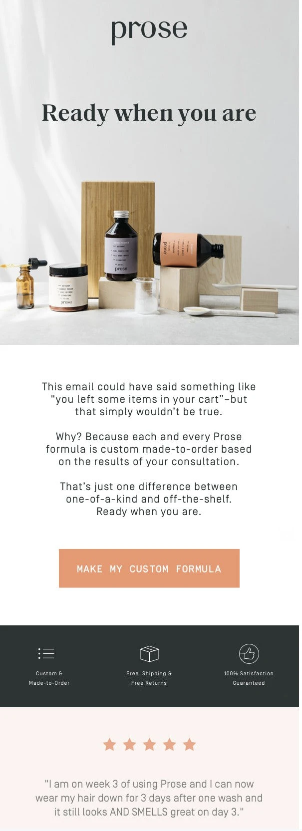
Alternatively, use persuasive copy in your cart abandonment recovery email, the way DTC clean beauty products brand Prose does.
What’s also notable here is a CRO marketing strategy of adding customer testimonials or social proof to convince the customer to make the purchase.
6) Optimize for mobile checkout
With the world now literally at our fingertips, implementing ecommerce conversion rate optimization for your checkout process on mobile is no longer optional—it’s essential. Your customers are on their mobile devices, seeking instant gratification. To adapt to this new wave of ecommerce, offer a mobile checkout experience that’s as seamless and effortless as your desktop version.
The key lies in making every touchpoint mobile-friendly. Ensure the text is legible, the buttons are easily clickable, and the navigation is effortless. A mobile checkout experience should feel like a smooth sail.
Accelerate your Shopify checkout process by integrating digital wallets like Apple Pay, Google Pay, or PayPal. Not only do they speed up transactions, but they also add an extra layer of security, a fact that will certainly resonate with your security-conscious customers.
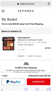
Look at Sephora for that instance which is not just optimized for mobile but includes multiple payment options along with easy checkout and added security.
7) Incorporate trust signals on the Shopify checkout page
Trust, they say, is the foundation of all relationships. This is just as true in ecommerce.
In a virtual shopping environment, customers can’t touch or try your products before they commit to buying. That’s why they need every reassurance that their decision to purchase from you is the right one.
The trust signals on your Shopify checkout page can be SSL certificates, badges from security providers like Norton or McAfee, customer testimonials, and clear return policies. These are your allies in assuring customers of their security. Even a small logo of a popular payment gateway can work wonders in building trust.
A lesser-known but equally powerful trust signal is clear and easy-to-find customer service information. This tells your customer, “We’ve got your back, any hour, any day.” This can be as simple as a chatbot ready to answer queries, a prominently displayed phone number, or a speedy email response team.
To cut it short, trust signals are your secret weapon to ease purchase hesitations. So go ahead, layer on the trust signals, and watch your conversion rates reach for the stars.
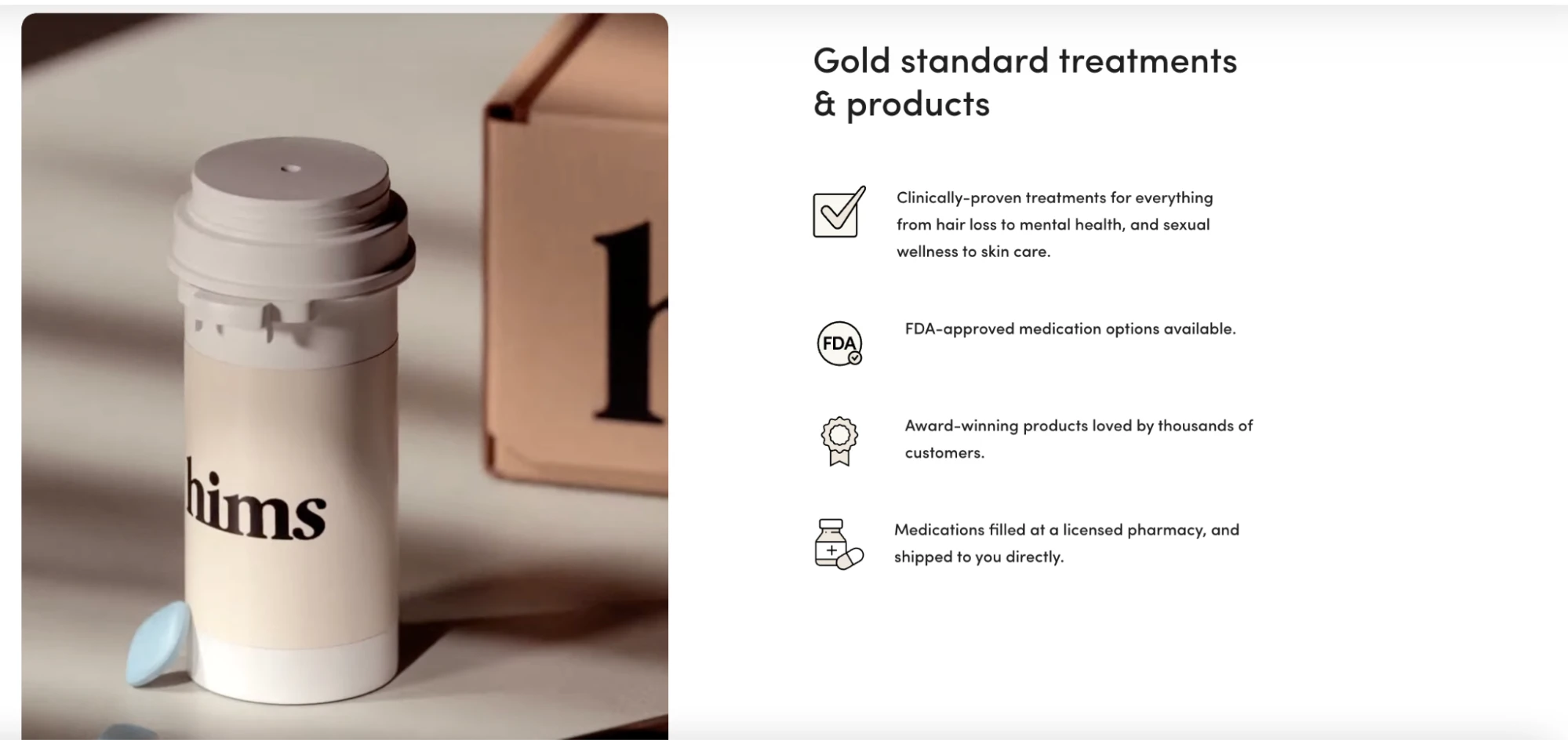
Hims is a men’s health brand that sells health and wellness products. To build trust, their website states: FDA-approved medication, medicines filled at a licensed pharmacy, and so on.
8) Multiple payment options
Payment is where the rubber meets the road. You want your customers to have a glitch-free experience at this stage of their shopping experience. That’s why it’s crucial to offer multiple payment options, the way Last Object does with Sezzle. The other payment options can be Google Pay, Amazon Pay, Buy Now Pay Later, and credit/debit cards.
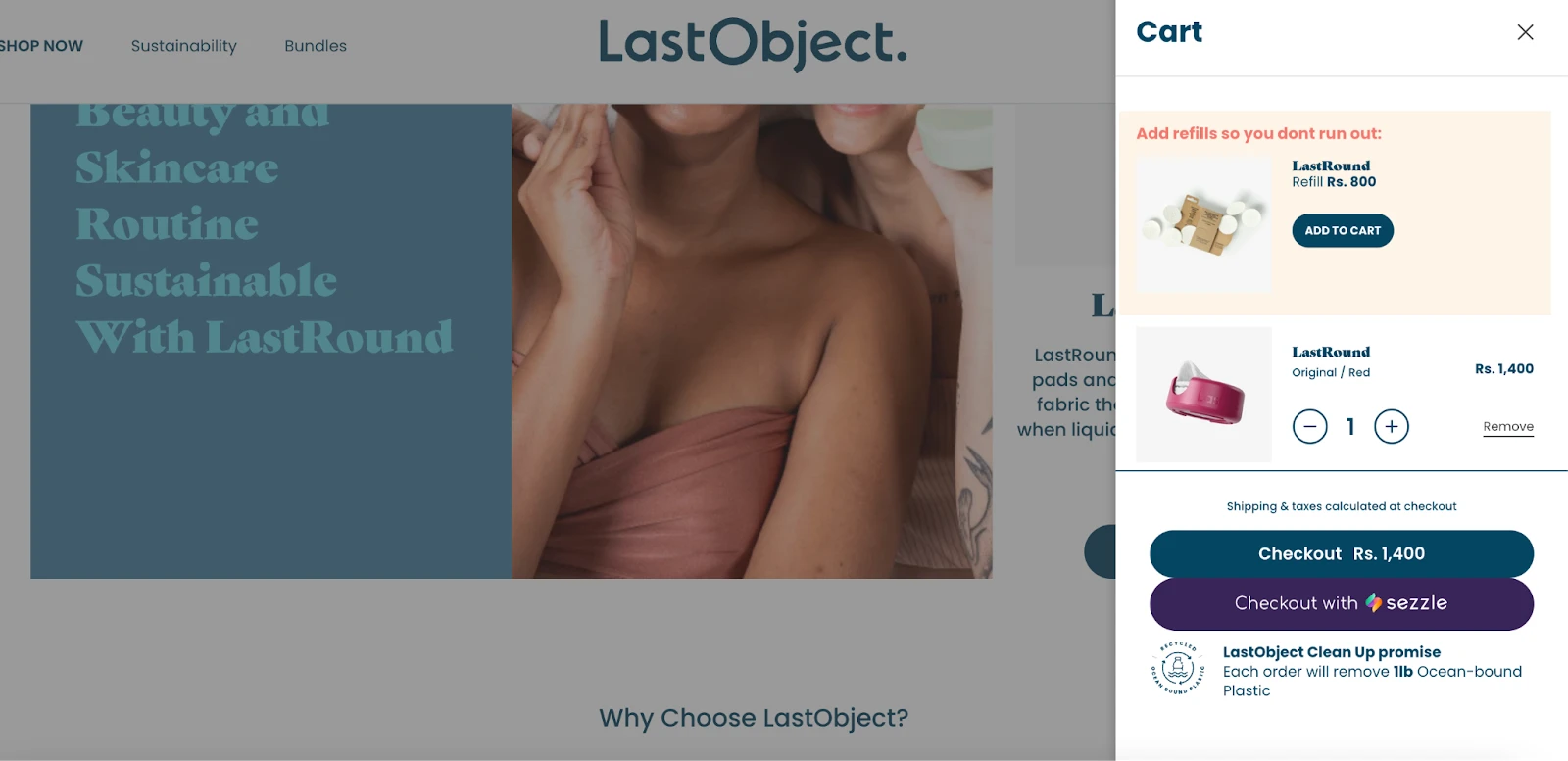
This flexibility not only enhances the user experience but also underlines your brand’s commitment to customer convenience and improves your website conversion rate optimization. Make sure to integrate local payment methods if you’re selling internationally.
The goal, as a checkout best practice, is to remove any roadblocks that might stop customers from completing their purchases.
9) Set expectations with custom banners
One super-easy yet effective way to keep your customers hooked and happy? Be real with them. It’s all about clear, transparent communication!
No one likes to be left hanging, especially when they’ve just clicked ‘buy’ on a product that they’ve been longing for.
And the best way of keeping them in the loop? ….Custom banners!
Think of custom banners as friendly little signposts at every step of your Shopify checkout journey. They’re there to tell your customers what’s happening, what’s next, and what they can expect. It’s like having a personal shopping assistant guiding you through the aisles of your online store.
You can use them to convey any message—be it the expected delivery date (Amazon rocks at this), stock availability (Ever seen Zara’s “Only a few left!” banner? Major FOMO trigger!), or even the return policy (Think of Nordstrom’s no-questions-asked return policy banner).
What’s more? Banners can also boost your sales! Flash a “Last chance to grab 10% off” or “Free shipping for the next hour” banner and watch your cart abandonments drop.
Custom banners provide customers with important information, real-time updates, and prompt actions. They instill that subtle nudge that the customer needs, giving them that sense of urgency and making their shopping experience less stressful and engaging.
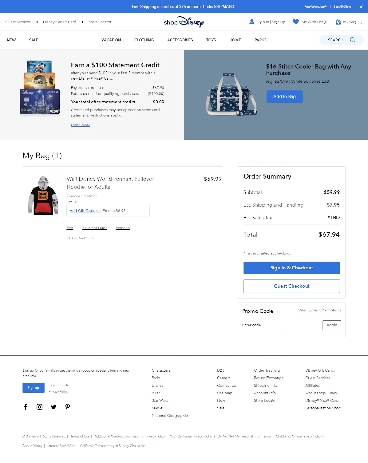
Check out Disney in the example here that has used a banner in the checkout page pertaining to loyalty programs.
10) Use product upsells to increase the AOV
While the customer is at the checkout stage, consider offering upsells to increase your ecommerce average order value (AOV).
This could be in the form of refills the way DTC laundry brand Last Object does, if you have products that need to be ordered periodically. Acquiring new customers is only getting more expensive, which is where upselling helps you increase the AOV from existing customers.

A few other ideas for upselling during checkout are:
- Offering bundles at checkout
- Combining slow-moving items with best sellers at a discounted price
- Encouraging customers to go for subscriptions with discounts
11) Add psychological triggers to reinforce sales
Think of the last time a countdown timer nudged you to grab a deal before it slipped away. Or when a “few items left” tag pushed you to make that instant purchase. We’ve all been there, enticed by these compelling psychological triggers. Now, let’s translate these into your Shopify checkout strategy so that they can work wonders for your sales graph.
Harness the power of psychological triggers in your Shopify checkout journey to augment sales. There are some of the best shopify countdown timer apps that create a sense of urgency and subtly push shoppers to convert their interest into a swift purchase, fearing they might miss out on a fantastic deal.
Another potent strategy is social proof. Seeing others validate a product often sways potential buyers. Incorporate reviews, ratings, or even a simple “popular choice” tag to make your product irresistible.
While these psychological triggers can act as solid sales catalysts, they need to be used with finesse. Overdoing them might backfire and create an atmosphere of hard selling.

So, like the Ecommerce clothes brand Madewell, keep the balance, create an intriguing narrative that tempts rather than terrifies, and watch your sales take a joyful leap.
12) Keep promo codes easily visible
It’s crucial to keep your promo codes unmissable on your Shopify checkout page. Remember, customers love a good bargain, and they will definitely appreciate your direct approach to presenting discount codes.
Imagine this: customers are in the final stretch of their purchase journey and they’ve selected their products, reviewed the cart, and are now on the verge of clicking ‘Checkout’. At this moment, if they notice a prominently placed promo code, they’ll likely perceive it as a win. This happiness, in turn, can cement their decision to complete the purchase. It is an added incentive at this point from the buyer pov.
Moreover, making promo codes easily accessible saves customers the hassle of hunting for discounts externally. It not only simplifies the checkout process but also keeps customers on your page, reducing the chances of your cart being abandoned.

A great conversion rate optimization example is of ecommerce lifestyle retailer Urban Outfitters which auto-deducts the item price on the checkout page, reducing the friction of the customer having to look for the promo code.
13) One-click checkout
As the phrase suggests, a one-click checkout feature on your Shopify checkout page is like a VIP pass for your customers.
By remembering the customer’s payment information and shipping details (given their consent, of course), you provide them the luxury of skipping various checkout steps in future purchases.
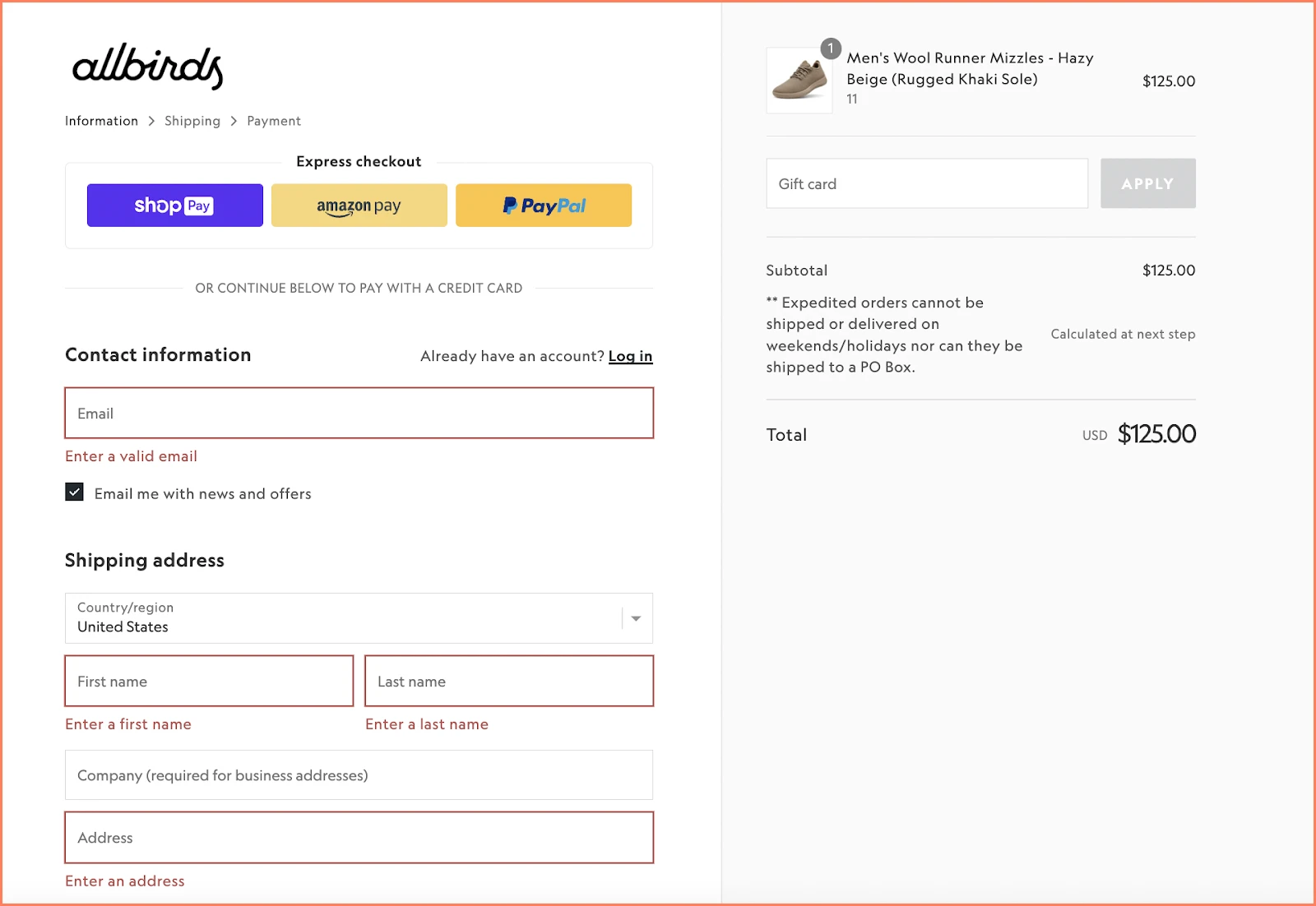
Ecommerce brand Allbirds offers ShopPay, Shopify’s one-click checkout option for a non-nonsense shopping journey.
14) Monitor and analyze the checkout performance
Understanding how your Shopify checkout is performing is an integral part of running a successful ecommerce business. Lifesight, an growth marketing platform for ecommerce brands, allows DTC and ecommerce business owners to leverage data to create high-converting campaigns.
Via Lifesight’s Shopify integration, you can segment contacts, create content, send hyper-personalized emails, analyze performance in real time, and optimize campaigns on-the-go.
As a no-code tool with pre-built templates, you can quickly create SMS, emails, and WhatsApp messages, collect customer data, automate post-purchase upsells, gather feedback, send recommendations, and build complex custom journeys by unifying all customer touchpoints.
Remember… The real success of a Shopify optimized checkout process lies not in its inception, but in its persistent fine-tuning based on your customer’s preferences.
Best Shopify Checkout CRO Examples
1) Tentree
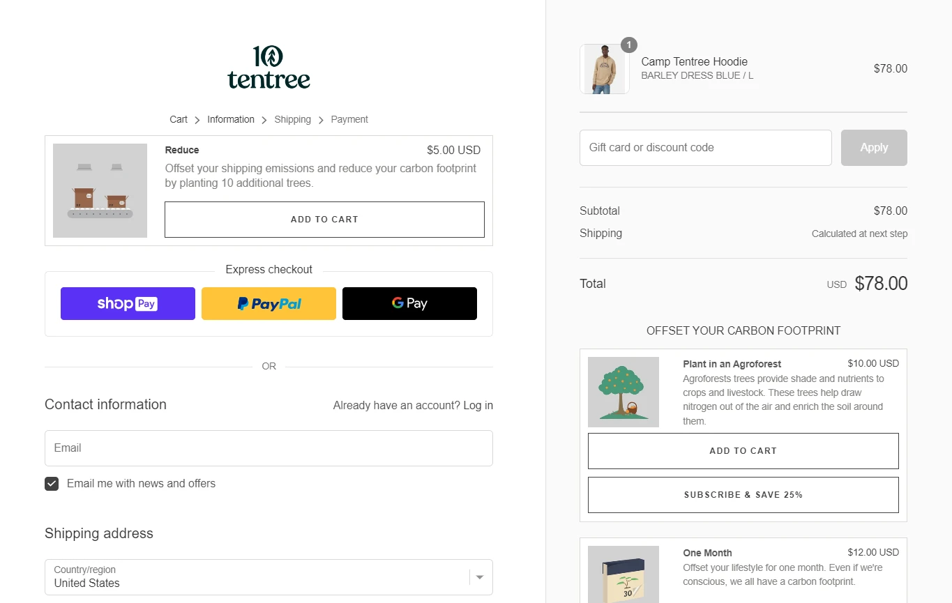
Tentree, a sustainable clothing brand, prioritizes environmental responsibility and tree planting.
During the checkout process, an exceptional aspect of their approach is the clear message they provide about offsetting one’s carbon footprint.
The brand conveys its message in a straightforward manner that avoids unnecessary cuteness or extravagance.
2) 123 BabyBox
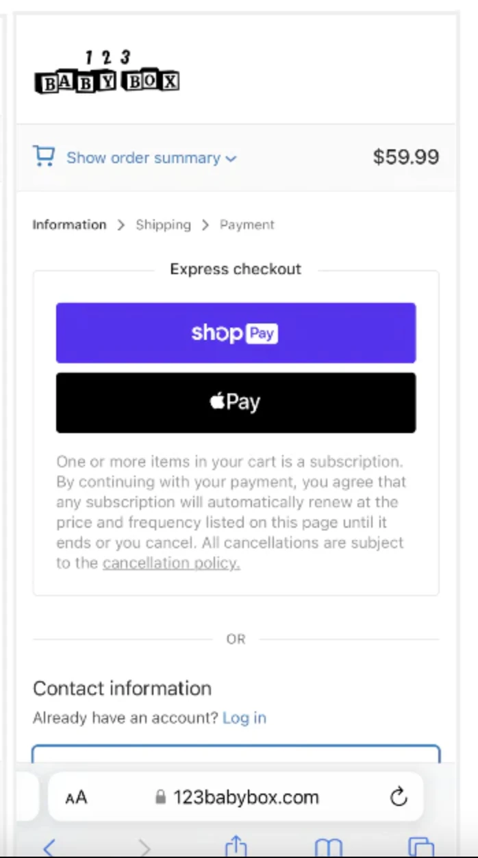
123 BabyBox is the perfect solution for parents seeking quality products for their little ones.
Notably, this brand’s mobile checkout process stands out as its highlight – it’s hassle-free and easy to use, made even better with their express checkout feature.
No more wasting time on tedious procedures and it is the best way to convert mobile users with a mobile-friendly Shopify checkout page.
3) Allbirds
Allbirds, known for their sustainable and cozy products made from natural materials such as eucalyptus and merino wool, offer shoes, flats, and clothing that redefine comfort.

However, what truly sets them apart is their transparent shipping policies during the checkout process. As a part of your Ecommerce conversion rate optimization strategy, clearly mention the terms and conditions on the checkout page.
4) Luxury Hair
Luxy Hair‘s clip-in hair extensions give the longer, fuller locks the shopper desires.
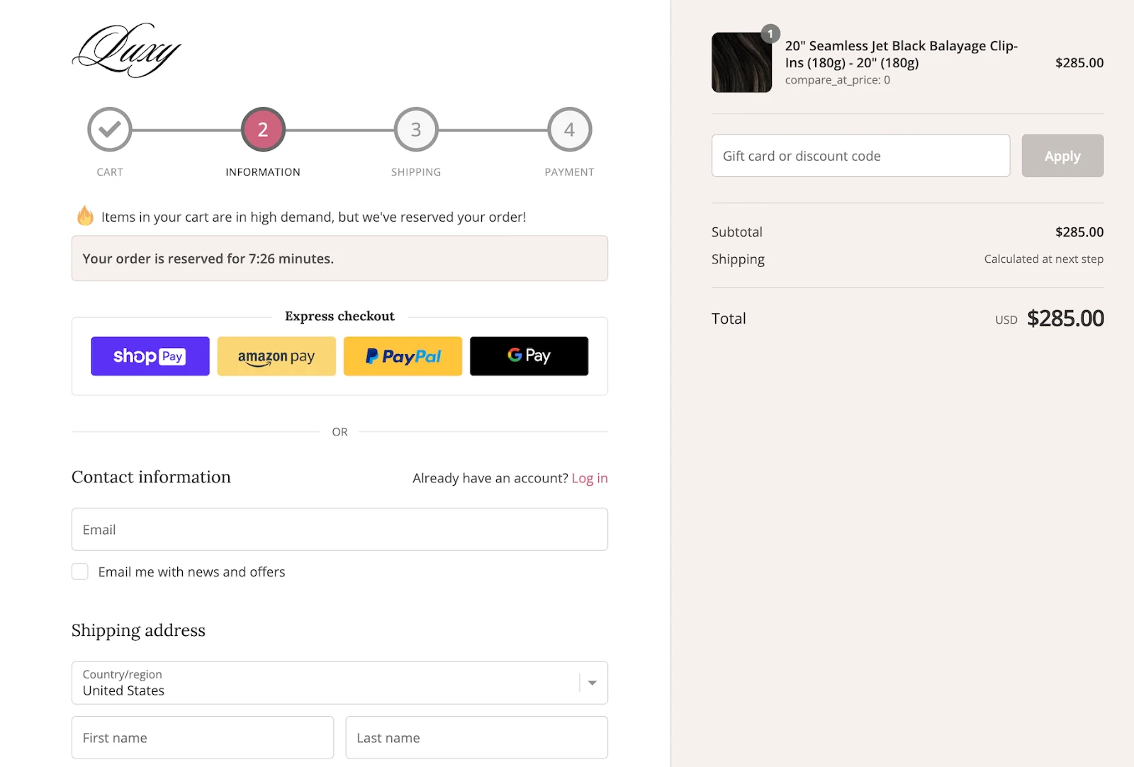
But what sets them apart is their ability to create an emotional experience during checkout. They incorporate a timer and fear of missing out (FOMO) element, that ignites a sense of urgency that captures shoppers’ attention and drives action.
Ready to optimize your Shopify checkout process?
Equipped with these conversion rate optimization strategies it is time to start implementing them in your Shopify checkout page. Remember to start with 1-2 strategies, test the results and move on to the next.
Sign up for a Lifesight to see in action how you can automate communication, improve engagement and maximize the ROI from new and existing customers.
FAQs
1) What is a CRO?
In the simplest terms, Ecommerce conversion rate optimization (CRO) is a set of strategies to increase the number of website visitors who make a purchase on your Ecommerce store. Your CRO strategies could involve adding products to the cart or even having a visitor click through a product.
2) How to edit the checkout page in Shopify?
In order to edit the checkout page;
- Firstly, go to your Shopify Admin
- Hover over Settings and then Checkout
- Now move to the Checkout Style section.
- Then click on Customize Checkout which will open the Theme Editor for you to begin editing.
3) How to speed up Shopify checkout?
The two ways to speed up Shopify checkout are:
- Offering auto-complete on the checkout form
- Guest or express checkout
4) How to enable express checkout on Shopify?
To proceed with this option on your Shopify;
- Go to Shopify Admin
- Click on Settings and find the Payments option.
- Under that section click on Accept Credit Cards which will give you the list of payment processors.
- Then look out for the option of Express Checkout
- Go ahead and click on the Edit link
- On the next page, you’ll have to enter the API credentials that are offered to you by the payment processor.
- After filling out all the necessary information, proceed to click the Activate button which would enable the Express Checkout feature for you.
You may also like
Essential resources for your success
