Understanding the contribution of each element in the marketing mix to sales and ROI can be challenging with MMM’s various methodologies. But, what if there was a way to simplify this process, and correlate each campaign metric with revenue outcomes?
With our newest Correlation and Scatter Plot Matrix feature addition, get a chart that displays all your campaign metrics in a clear, date-aligned tabular format. With this feature, understand the intricate relationships of your marketing data with your growth metrics, to uncover valuable insights with precision and ease.
What is a Correlation Matrix?
A Correlation Matrix is a statistical tool that shows how different variables are related to each other. In the context of Marketing Mix Modeling, a Correlation Matrix is important because it helps understand the relationships between different marketing elements (like TV ads, online ads, radio spots) and business outcomes (like revenue or brand awareness).

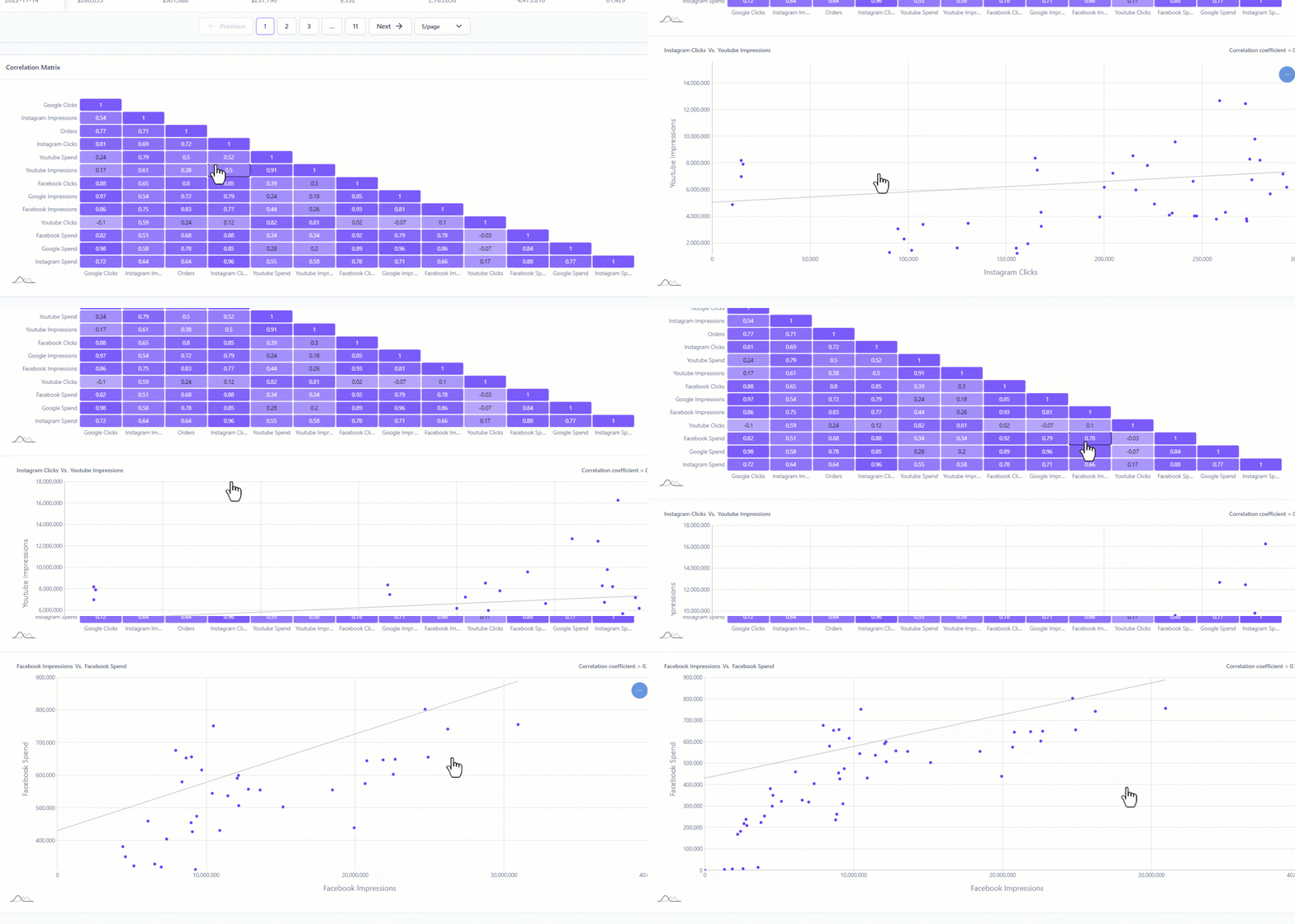
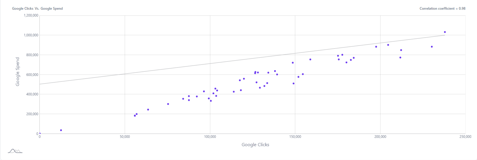
This feature transforms your dataset into a visually engaging matrix, where each cell represents the strength of the relationship between two variables, ranging from -1 to +1. But it’s not just about numbers, by clicking on a cell, you bring to life a detailed scatter plot, providing a visual story of how two variables correlate. This interactive approach makes it easier to grasp complex data relationships and extract meaningful insights for strategic decision-making.
The scatter plot is used when the analyst wants to understand the trend of a variable against, for example, the dependent variable, to discover whether there is some kind of strong correlation between the variables that they are analyzing.
Key to Comprehensive Data Visualization
The Correlation Matrix feature displays a detailed square matrix chart, providing an overarching view of the interconnections between various components of your marketing strategy.
- Detailed Platform Engagement Assessment: Examine the relationship between your advertising spend and engagement metrics such as impressions and clicks. This table offers a clear and concise overview of how your spending translates into customer engagement levels.
- Interactive Scatter Plot Analysis: Enhance your understanding by exploring the correlation matrix further. Clicking on any cell within the matrix brings up an interactive scatter plot. This plot provides a detailed analysis of the relationship between any two selected variables, giving you a granular view of how these elements correlate.
- Strategic Platform Spend Analysis vs. Key Performance Indicators (KPIs): This feature enables you to visualize your marketing expenditure in relation to your KPIs. By presenting this data side-by-side, you can effectively assess the impact of your spending on achieving key business objectives.
From understanding the intricate dynamics between different marketing channels to assessing the impact of expenditure on key performance indicators, this tool simplifies complex data analysis. Experience the power of visual data interpretation with the Correlation Matrix in Lifesight’s MMM module.


