The digital marketplace is highly competitive. Making a user-friendly website and driving traffic alone is not enough. Ecommerce DTC brands must leverage and maximize the impact of their website traffic on the bottom line. But how do they do this? Tracking, prioritizing, and doing what it takes to optimize their conversion rate is the key. As marketers you need to understand these two very important terminologies here:
- Ecommerce conversion rate
- Conversion rate optimization
Ecommerce Conversion Rate
Many people visit a website, but the percentage who actually take the desired action is known as conversion rate. There can be many actions that qualify as a conversion for an ecommerce website. The following typically qualify as conversions:
- Online sale
- Email/Newsletter Subscription
- Products added to the cart/wish list
- Share on social media
A low conversion rate compared to the industry average of 2% on mobile devices and 3% on tablets/desktop or your top competitors is a clear indication that you need to optimize your conversion rate. A good conversion rate varies from industry to industry (Health and well-being has the highest conversion rate @ 3.72%). However, conversion is important for any business, and therefore the overall user experience on your website matters. After all, seamless user experience leads to higher conversion.
Conversions can occur anywhere on your website be it your homepage, blogs/resources page, product page, landing pages, etc. The secret to maximizing the potential of converting website visitors into paying customers is optimizing each location. Conversion rate optimization (CRO) of a website’s home page, product page, landing page, and all customer touchpoints on the website is crucial for high conversion rates. But wait, what exactly is CRO? Let’s find out.
What is Conversion Rate Optimization
Conversion rate optimization (CRO) refers to a well-thought-out and planned process of improving the overall performance of the website. The intent is to ensure that a larger percentage of website visitors take the desired action or convert from visitors to customers. In simple words, CRO is all about improving the likelihood of website visitors taking an action a business desires.
The process is all about understanding the user/customer journey through your website, the actions they take, and the roadblocks that stop them from completing the action you desire. It is also about bringing more value to what you do, whether that’s more customers, more repeat sales, or more signups to your email list.
Implementing CRO
As we said, the potential to convert can happen anywhere on your website. However, we suggest implementing CRO, especially in these four areas of your website to make the most of your CRO strategy.
- Homepage: First impressions matter and can often be dealmakers or deal breakers. The homepage of a website is the first page a visitor would look at and form their impression about your brand. An attractive and well-optimized (we are not just talking SEO here but CRO too) homepage has the potential to retain visitors and generate enough curiosity for a visitor to explore other areas of your website making the homepage a strong candidate for CRO.
- Pricing Page: Pricing is perhaps one of the most important pages for any ecommerce website and often determines whether a user will convert or not. Implementing CRO on the pricing by modifying the pricing intervals, describing the product features associated with each price band, including a phone number for visitors to call for a price quote, etc. can trigger visitors to take the desired action.
- Blog/Knowledge resource page: Knowledge resource/blog pages have a high potential to generate conversion opportunities for a website. Blogs are not only a great way to educate readers about your product and services, and what your company is about, but they also have the potential to convert readers into leads. How can CRO help? A few examples could be adding calls-to-action (CTA) throughout a content piece or nudging readers to submit their email addresses in exchange for an industry report.
- Landing Pages: The intent of creating a landing page is to make sure that visitors take the desired action, they are designed for the job. No surprise to guess that landing pages get maximum conversions, all the more reason to implement CRO.
Now that we are aware of which areas of the website should we focus on for CRO implementation, let’s look at the various CRO strategies that can help you as a business to maximize your revenue and profits. So, let’s walk through each of the CRO strategies.
1) Improve website speed and performance
We are a fast generation with small attention spans and even lesser patience. Gone are the days when one would patiently sit in front of their computer screen for hours waiting for a website or email to load and open completely. It is so 90s. We are living in the 5G and high-speed broadband era. A slow website is the last thing anyone wants to deal with and often can be a turnoff for potential customers. The loading speed of your website matters. Consider these numbers:
- 1 out of 4 visitors abandon websites that have a loading time of more than 4 seconds
- A whopping 64% of customers will not return to your website if it’s slow and their overall experience is dissatisfactory. They would shop from a competitor the next time.
It’s imperative for ecommerce brands to work on their website speed and performance by implementing optimization techniques such as caching and minifying.
2) A/B tests to identify optimization opportunities
A well-designed product page is often the first point of contact and an opportunity waiting to convert. Adding high-quality product images and videos, clear and detailed product descriptions, actual customer reviews, and strategically placed CTAs are some of the ways to get maximum conversions. At the same time, it is also important to experiment with the look and design of your product page to see what is generating better conversions. At times, it could be as simple as changing the position or color of the CTA button.
3) Ease of navigation and usability
There are nearly 800,000 ecommerce brands in the US and DTC brands comprise 13% of all ecommerce brands which is approximately 110,000-120,000 brands. Keeping your website navigation simple is important and plays a vital role in distinguishing your brand. A well-organized and easy-to-use navigation system seamlessly directs visitors to various pages and relevant information on the website. The key to increased sales and customer loyalty is a simple and user-friendly website that keeps people on your site for an extended period of time.
Any potential customer visiting a website needs clarity on two things when browsing through your website:
- Where am I?
- Where else can I go?
Addressing these in your navigational structure will ensure high conversion rates. You can achieve this by putting together a website that is clutter free, well organized, has clear product categories, easy-to-use search functionality, and is overall easy to navigate.
Daily Harvest is a popular online meal delivery service that offers a variety of healthy soups, smoothies, and meal bowls at their customers’ doorstep. The website has a clean and easy-to-read navigation bar with equally attractive food pictures. All the food categories are listed in the drop-down menu on the homepage itself making the website user-friendly.
4) Persuasive copywriting and compelling CTAs
Providing content that provides clear information about your product or service and having the right punch can work wonders. A few ways to do it could be by listing out the benefits of the product and strategically placing user-generated content (ratings and reviews) on the product page.
Sparingly use strong and creative CTAs compelling visitors to take action. However, crowding your page with too many CTAs or putting all of them together in one place can overwhelm the customer. On each page only put CTAs that compel them to take an action on that page.
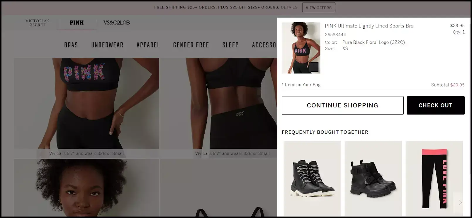
Victoria’s Secret, a well-known American lingerie and beauty brand, strategically employs CTAs. When a customer adds an item to their cart, a window with two CTA buttons appears. The “Continue Shopping” button encourages the customer to browse the website more, whereas the “Check Out” button directs the customer to the checkout page.
persuasive-copywriting-and-compelling-ctas-example-victorias-secret
Compelling and strategically placed CTAs are what drive the customers to take the desired action instead of abandoning the website.
5) Customer segmentation and personalization
Today the market is filled with a plethora of powerful software solutions that can help brands track the customer journey and segment them. This affords brands the possibility to personalize the user experience. Leverage the best of technology and create personalized experiences for your customer. Proper customer segmentation and communicating with customers with content that is of interest and of some relevance to them will shorten the path to purchase and increase your conversion rates.
6) Offer personalized recommendations and upsells to increase AOV
Tracking the user browsing behavior and wish list you could send special discount offers and product recommendations that would interest them. For example, if someone is checking out plaid shirts you could list similar other plaid shirts available on your website on the product page below or similar shirts on a discount. Similarly, you could give them an option to ‘shop the look’ and add links to the products that went into creating the distinct look for their easy access.
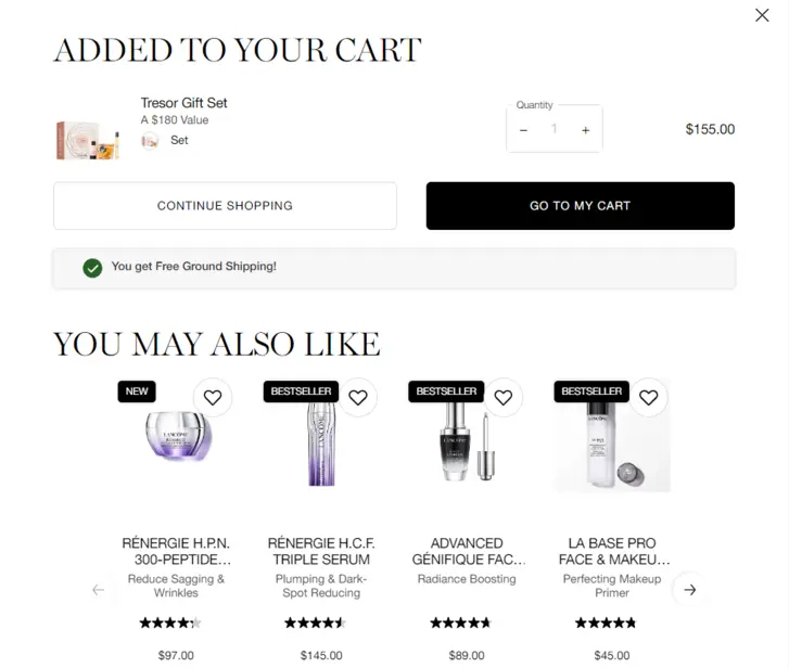
Lancome, a luxurious beauty brand suggests additional purchases that match well with the one the buyer has just added to their shopping cart.
offer-personalized-recommendations-and-upsells-to-increase-average-order-value-example-lancome
7) Easy and short checkout process
Lengthy complicated checkout process and asking customers to forcibly register to complete their purchase can be a major turn-off. 24% of shoppers abandon their carts when asked to create an account or register at the time of checkout. Keep it simple and short, and let them feel that they have a choice and control.
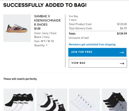
Even Adidas has a guest checkout option. The catch is that only members receive free shipping, while non-members do not. Now that’s excellent marketing!
easy-and-short-checkout-process-example-adidas
8) Implement cart, browse, and remarketing campaigns
The cart abandonment rate is as high as 75%, and designing campaigns to bring customers back to the abandoned cart is extremely important. Implementing CRO tactics to make sure customers complete the purchase process. As a part of the CRO analysis run surveys to determine the top reasons for cart abandonment and make the required changes. Once you have implemented the change, run an A/B test to determine what changes yield the desired outcomes. In simple words, do not ignore those abandoned shopping carts, spend time on remarketing campaigns.
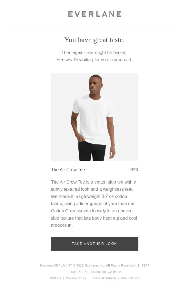
Everlane uses attention-grabbing subject lines in their abandoned cart emails. By including “Looking for something?” as the subject line of the email, they entice the customer to open it. After that, a description of the product is included in the email while also praising the customer for their excellent taste. Also, the call-to-action button stands out and makes the customer want to return to the site.
implement-cart-browse-and-remarketing-campaigns-example-everlane
9) Utilize pop-ups to capture leads and increase sales
Pop-ups have been a tried and tested tool in a digital marketer’s arsenal to build quality email lists, get subscribers for newsletters, and get more visitors to convert to buyers. From a CRO perspective, it is a great idea to add pop-ups with special discount codes on the homepage.
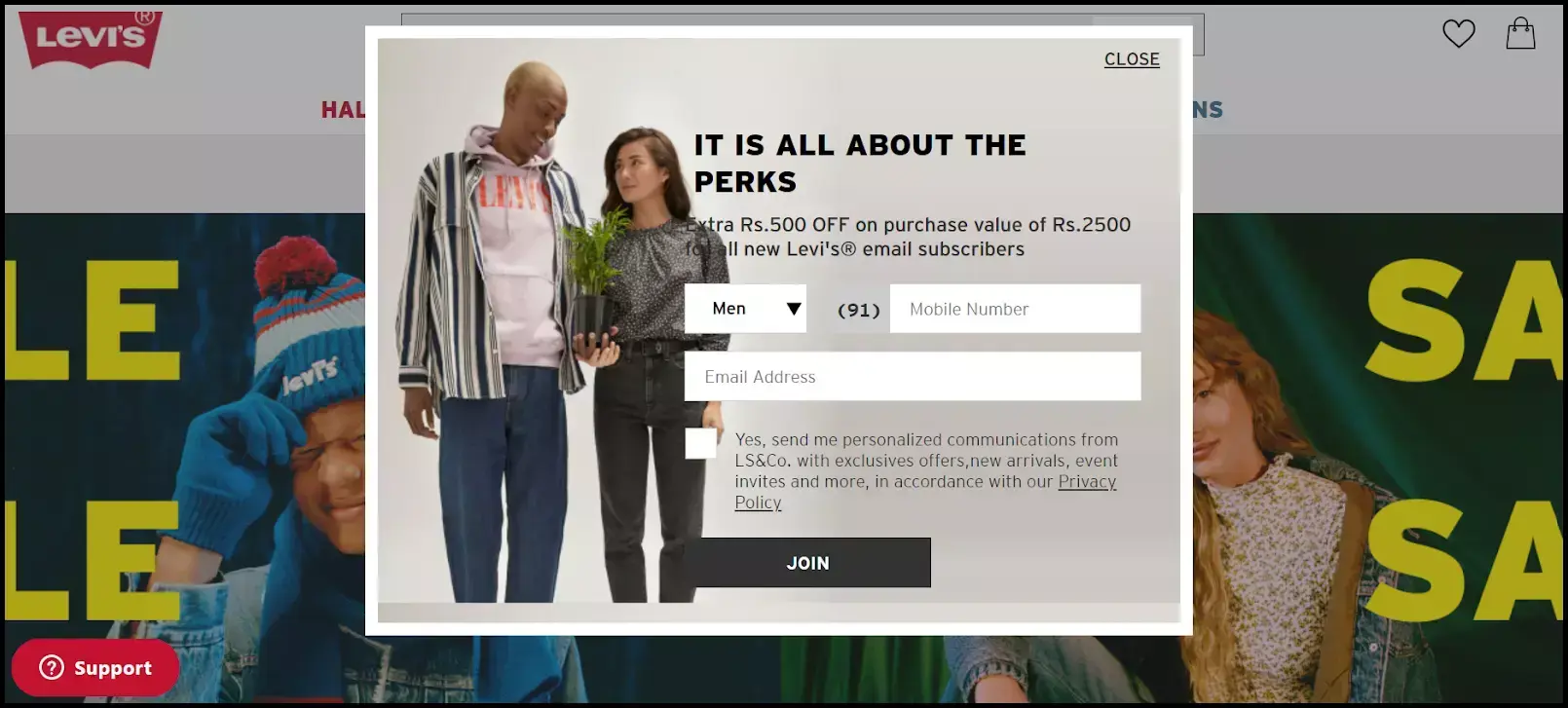
Levi’s leverages pop-ups to offer discounts to new customers who sign up for the website.
utilize-pop-ups-to-capture-leads-and-increase-sales-example-levis
10) Make your website mobile-friendly
The number of smartphone users in the United States is consistently increasing. At present, there are 307 million smartphone users in the country. Today most people do all their day-to-day tasks like checking emails, paying bills, banking, and even online shopping on their phones. For any business to get more conversions having a mobile-friendly website is, therefore, a non-negotiable.
Tools To Improve DTC Conversion Rates
A good CRO tool should be easy to set up and focused on getting more conversions. Most importantly, minimize the impact of other apps in the background for a seamless customer experience. The below three tools are quite useful when it comes to CRO and improved conversion rates of ecommerce DTC brands.
1) HotJar
One of the most popular tools in the market, Hotjar enables brands to understand how their users interact with their websites.
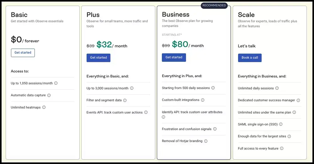
Pricing: HotJar offers 4 plans Basic, Plus, Business, and Scale with Basic being a free plan. Details of each of the plans are listed below:
hotjar-pricing
How does it work: HotJar helps brands go beyond traditional product and web analytics to truly understand their user behavior, identify gaps, and work towards creating a delightful user experience. Their heat mapping tool gives insights into the functionality of every click, cursor movement, and scroll-depth mapping. Brands can see where users click, and scroll the website which helps them understand a particular customer’s behavior pattern.
Heatmaps help visualize user behavior, the recordings feature enables brands to see what users are looking at, and feedback and surveys help gather insights on how and what visitors feel about your website. Armed with this information HotJar helps implement suitable engagement strategies that lead to higher conversions.
2) Google Analytics
We are all aware of how valuable Google Analytics can be in the growth story of any website. There was no way that it would not make it to our top 3 list. Google Analytics gives a holistic view of visitors browsing your website with information such as
- Number of new and repeat visitors
- Average time spent on the website
- Bounce rate
- Details on the browser used
- Traffic generated from mobile and web
- Number of visitors actually converted
- Interaction or touchpoint that lead to the conversion
Google Analytics as a tool is a goldmine of data and tools no website should not leverage.
3) Microsoft Clarity
The Clarity tool is an easy-to-use, no-cost tool for observing how actual people interact with your website. Getting started is simple, and you’ll have data in a matter of minutes.
Top Features:
- Include Instant heatmaps
- Session recordings
- Powerful insights
- Google Analytics integration.
Closing thoughts
There has been a phenomenal shift in our personal and professional preferences in the last decade. The ever-evolving internet and telecommunications technology have been the key driving force in the online shopping boom. Not that offline retail is not seeing any growth, but having a strong online infrastructure is no longer a good thing to have, it is a must-have for businesses in the current scenario.
Launching and running a website that is CRO optimized and user-friendly is critical to both short and long-term business goals and success. Boosting ecommerce conversion rates is now the top priority for businesses and should rightly be so. After all, nudging the customers to buy your products and services is in the best interest of your business. Getting customers who convert lies at the heart of everything businesses do.
You may also like
Essential resources for your success
