Introduction
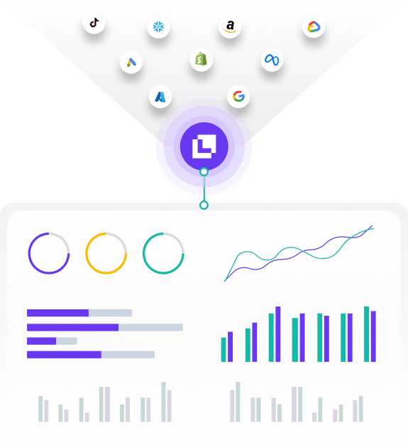
Google Data Studio is a powerful tool that allows users to create custom reports and dashboards using data from various sources, including Google Analytics. This integration helps businesses visualize their data in a more understandable and actionable way, enabling better decision-making and enhanced insights into performance metrics. In this guide, we’ll walk you through the process of connecting Google Analytics with Data Studio, creating compelling reports, and making the most of your data.
Step-by-Step Guide
1. Create a Google Data Studio Account
Sign Up:
- Go to the Google Data Studio website.
- Click on “Get Started” or “Sign Up” if you’re not already logged in with your Google account.
- If you have a Google account, log in with your credentials; otherwise, create a new account.
Dashboard Overview:
- After logging in, you will be directed to the Data Studio dashboard.
- Here, you can start creating new reports or access existing ones.
2. Connect Google Analytics to Data Studio
Start a New Report:
- Click on the “+ Blank Report” button or “Create” to start a new report.
Add a Data Source:
- On the new report page, click on “Add Data” in the toolbar.
- Select “Google Analytics” from the list of available connectors.
Authorize Access:
- You may be prompted to authorize Data Studio to access your Google Analytics data.
- Follow the on-screen instructions to grant access.
Choose Your Account and Property:
- Select the Google Analytics account, property, and view you want to use.
- Click “Add” to include this data source in your report.
3. Customize Data Source Settings
Configure Data Settings:
- Once the data source is added, click on “Resource” in the top menu and select “Manage Added Data Sources.”
- Here, you can adjust settings such as date ranges, metrics, and dimensions if needed.
Verify Data:
- Ensure that the data source is pulling the correct data by checking sample data in the “Data” tab.
4. Create Your Report Layout
Add Components:
- Use the “Add a Chart” button to include various types of charts (e.g., bar charts, pie charts, time series) in your report.
- Drag and drop these components onto the report canvas.
Customize Charts:
- Select each chart to customize its data. For example, you can choose dimensions (e.g., “City,” “Device Category”) and metrics (e.g., “Sessions,” “Bounce Rate”) to display.
- Adjust the chart’s appearance, including colors, labels, and legends.
Add Filters and Controls:
- Use the “Add a Control” option to include filters (e.g., date range filters) that allow users to interact with the report.
- Customize these controls to fit your reporting needs.
5. Apply Filters and Segments
Create Filters:
- Click on “Add a Control” and select “Drop-down List” or “Date Range” from the menu.
- Configure filters to enable users to view specific segments of data, such as traffic from different sources or specific time periods.
Apply Segments:
- Use segments to compare different subsets of your data. For example, create segments for “New Users” vs. “Returning Users” to analyze behavior patterns.
6. Add and Format Text and Images
Insert Text:
- Click on “Add a Text Box” to insert titles, labels, or descriptions into your report.
- Format the text using the toolbar options for font size, color, and alignment.
Add Images and Logos:
- Click on “Add an Image” to include logos or other visual elements that enhance your report’s appearance.
- Resize and position images as needed.
7. Create and Share Interactive Dashboards
Preview and Test:
- Use the “View” mode to preview your report and ensure all elements are functioning correctly.
- Test interactive components like filters and controls to confirm they work as expected.
Share Your Report:
- Click on the “Share” button in the top right corner.
- Choose to share via email, link, or publish the report to the web. Set permissions to control who can view or edit the report.
Embed Reports:
- For integration into websites or internal platforms, use the “Embed Report” option to get the embed code.
8. Automate Report Refreshes
Schedule Data Refreshes:
- Go to the “File” menu and select “Report Settings.”
- Set up automatic data refreshes to ensure your report always displays the most recent data.
Notify Stakeholders:
- Configure email notifications to alert stakeholders when the report is updated.
9. Analyze Data and Generate Insights
Review Key Metrics:
- Focus on important metrics such as sessions, bounce rate, and conversion rate.
- Use charts and graphs to identify trends, patterns, and outliers in your data.
Create Data Stories:
- Utilize insights from your data to build compelling narratives.
- Highlight key findings and use visualizations to support your conclusions.
10. Refine and Iterate Your Reports
Gather Feedback:
- Share your reports with team members or stakeholders and gather feedback on usability and data relevance.
Make Improvements:
- Based on feedback, refine your report’s layout, charts, and filters to better meet the needs of your audience.
- Continuously update and enhance your reports to reflect changing business goals or new data sources.
Summary
Using Google Data Studio with Google Analytics enables you to create customized, interactive reports that can enhance your understanding of your website’s performance and user behavior. By following these steps, you can connect your Google Analytics data, build visually appealing reports, and utilize filters and controls to interact with your data. Automating report refreshes and sharing insights with stakeholders ensures that your data remains relevant and actionable.
Free essential resources for success
Discover more from Lifesight


