An email footer, also known as an email footer signature, is a small yet essential component of email communication that can make a significant impact on a business’s branding, marketing, and communication efforts.
It is the text that appears at the end of every email and typically includes the sender’s name, title, and contact information. Additionally, email footers can also contain links to social media profiles, company websites, and legal disclaimers.
How an email footer can elevate your brand’s credibility and success?
Email footers can also serve as a powerful marketing tool. According to Hubspot, 86% of consumers want to receive promotional emails from companies they do business with, and including a call-to-action in an email, the footer can increase click-through rates by up to 43%. By including a link to a company’s website or social media profiles, businesses can increase their visibility and drive traffic to their online platforms.
A well-designed email footer can help you stand out from the competition, establish your brand’s credibility, and build trust with your audience. Here are some benefits of having a well-designed email footer:
- Professional appearance: In the digital age, first impressions are often formed based on how professional and well-put-together your communications look. An email footer that features your company logo, brand colors, and other design elements can help your emails look more polished and cohesive. Including key information such as your job title, phone number, and email address can make it easier for recipients to contact you, making your communications more effective overall.
- Brand recognition: A consistent email footer that features your brand’s visual identity can help make your emails more recognizable and reinforce your brand’s message. By using the same email footer design elements across all of your emails, you can create a sense of continuity and consistency that can help your brand stand out in your recipients’ inboxes. Additionally, including links to your website, social media channels, and other online platforms can make it easier for recipients to engage with your brand and learn more about what you have to offer.
- Increased credibility: An email footer that includes relevant certifications, awards, or other recognition can help establish your brand as an authority in your industry. By highlighting your expertise and experience, you can build trust with your recipients and demonstrate that you are a leader in your field. Additionally, including links to relevant articles, blog posts, or other content can help showcase your thought leadership and reinforce your brand’s messaging.
- Establishes trust: Including important information such as your physical address, social media links, and other contact information can help build trust with your recipients. By providing multiple ways to get in touch with you, you can make it easier for recipients to engage with your brand and feel confident that they can reach you if they have any questions or concerns. Additionally, including links to your privacy policy or other relevant legal information can help reassure recipients that their personal data is safe and that your brand takes data protection seriously.
Designing an effective email footer that packs a punch
Here are some email footer best practices for creating an effective email footer:
1) Personalized content
Different audiences have varying needs and expectations, so personalizing the content can significantly enhance the email’s effectiveness. For example, for potential customers, including a clear and compelling call-to-action (CTA) in the email footer can encourage them to take action and visit the company’s website or schedule a consultation.
On the other hand, for existing clients, providing personalized contact information or links to relevant resources can help strengthen the relationship and reinforce trust in the brand. By catering to the specific needs and interests of the audience, brands can increase the chances of the email being well-received and acted upon, resulting in more conversions and ultimately, revenue.
Casper, a mattress-in-a-box brand that offers a range of high-quality sleep products. They tailor their content to their audience by providing educational resources on their website and blog that help customers improve their sleep quality. This approach helps to build trust with their customers and positions them as experts in the sleep industry.
2) Formatting and design
A visually appealing and easy-to-read email footer can make a significant difference in how the recipient perceives the brand and its messaging. It’s essential to follow the email footer best practices for formatting and design to ensure that the email footer is well-organized and easy to navigate.
This includes using a simple layout that separates each piece of information into clear and concise sections. Additionally, using a consistent font size and color that aligns with the company’s branding can help reinforce brand identity and recognition. It’s also recommended to include sufficient white space to improve the email’s readability and to avoid overcrowding the footer with too much information. By following these email footer best practices, businesses can create an aesthetically pleasing and professional-looking email footer that enhances their brand image and communication efforts.
For example, Harry’s is a men’s grooming brand that offers a variety of shaving and grooming products. They use a clean and simple email footer design that aligns with their branding and includes only essential information, such as contact details and social media links. This approach helps to make their emails easy to read and navigate.
3) Including relevant contact information
The email footer should include relevant contact information that recipients can use to easily reach out to the sender or the company. This is a vital component of an effective email footer as it can help establish trust and credibility with the recipient. It’s essential to include the sender’s name, job title, phone number, email address, and physical address in the email footer to provide various options for communication. Additionally, providing links to the company’s social media profiles can further enhance the email footer’s effectiveness by allowing recipients to connect and engage with the company on other platforms. It’s crucial to ensure that all contact information is up-to-date and accurate, as outdated information can create confusion and hinder communication.
For example, Warby Parker, the eyewear brand includes their physical address, phone number, and email address in their email footer. They also provide links to their social media profiles and customer service page.
4) Incorporating legal disclaimers and company logos
Incorporating legal disclaimers in the email footer is essential, particularly for businesses that handle sensitive information. A legal disclaimer can include information about data protection policies and confidentiality, ensuring that the recipient is aware of the company’s policies and practices. It’s important to ensure that the disclaimer is concise and easy to understand to avoid confusion or misinterpretation. By including a legal disclaimer, businesses can protect themselves from potential legal issues and establish trust with the recipient. In addition to legal disclaimers, incorporating the company logo in the email footer can help increase brand recognition and reinforce a consistent brand image across all communication channels.
For instance, Him’s is a men’s wellness brand that includes a legal disclaimer in their email footer that states their products are not intended to diagnose, treat, or prevent any disease. They also include their logo, which helps establish brand identity and increases brand recognition.
Best email footer examples to inspire your own
Following are a few best email footer examples that you can take inspiration from and leverage to elevate your brand to new heights:
Lokai
Fashion and lifestyle brand Lokai’s email footer encourages subscribers to follow the brand on social media. The footer features icons for Lokai’s various social media platforms, including Instagram, Facebook, and Twitter, as well as a call-to-action that invites subscribers to “join the movement.”
This email footer is a great example of how to leverage your social media presence to boost your brand. By including social media icons and a clear call-to-action in your email footer, you can encourage your subscribers to engage with your brand on multiple platforms and stay up-to-date on your latest news and promotions.
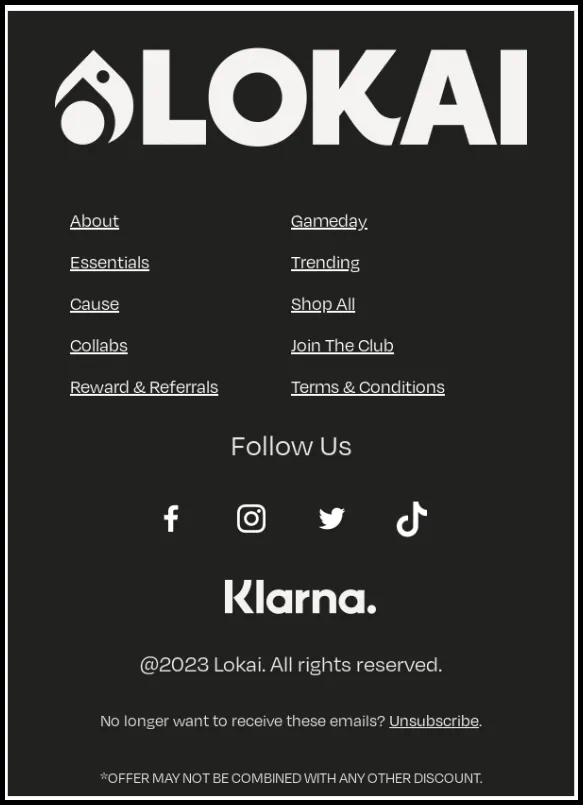
Another key takeaway from this example is the use of a clear and compelling call to action. By inviting subscribers to “join the movement,” Lokai is tapping into the emotional appeal of their brand and encouraging their audience to feel like they are part of something bigger. This is a powerful way to build brand loyalty and keep your subscribers engaged over the long term.
Mode Chocolate
This email footer from Mode Chocolate is a great example of how to use your email footer to provide customer service and support. By including a list of FAQs, you can help customers find answers to common questions without having to contact your support team directly. This can save time and resources for both you and your customers, and can help improve the overall customer experience.
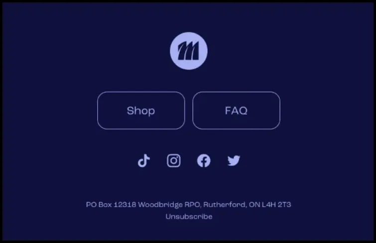
One thing to note about this example is the use of a clear and concise layout. The FAQs are presented in a simple bullet-point format, making it easy for customers to scan and find the information they need. Additionally, the link to the brand’s contact page is prominently displayed, giving customers a clear next step if they can’t find the answer they’re looking for.
Djusie
Djusie’s, an online jewelry retailer, email footer is designed to make it easy for subscribers to unsubscribe from the brand’s emails. The footer includes a clear and prominent “Unsubscribe” link, as well as a message that reassures subscribers that their decision to unsubscribe will be respected.
This email footer is a great example of how to handle the process of unsubscribing in a respectful and user-friendly way. By placing the “Unsubscribe” link near the top of the email footer and making it stand out with a different color or font, you can ensure that subscribers can easily find it and take action if they no longer wish to receive your emails.
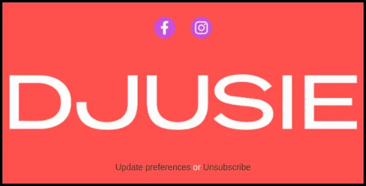
Another key takeaway from this example is the importance of respecting your subscribers’ decisions. By including a message that reassures subscribers that their decision to unsubscribe will be respected, Djusie is demonstrating a commitment to customer satisfaction and a willingness to put the customer’s needs first.
BetterBrand
The email footer of BetterBrand, an eco-friendly clothing retailer, is designed to remind customers about the brand’s mission and values. The footer includes a short statement about the brand’s commitment to sustainability, as well as links to the brand’s social media accounts and website.
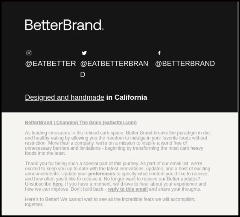
This email footer is a great example of how to use your email footer to reinforce your brand’s mission and values. By including a short statement that highlights your brand’s commitment to a particular cause or principle, you can help build a stronger emotional connection with your customers and differentiate your brand from competitors. Additionally, the use of icons and links to the brand’s social media accounts can help customers engage with the brand and learn more about its mission and values.
Cult Beauty
This email footer of beauty retailer Cult Beauty’s is a great example of how to use your email footer to encourage customers to refer their friends and drive new business to your website. By offering a clear incentive for referrals and making it easy for customers to share your brand with their network, you can increase the likelihood of word-of-mouth marketing and improve the overall reach of your brand.
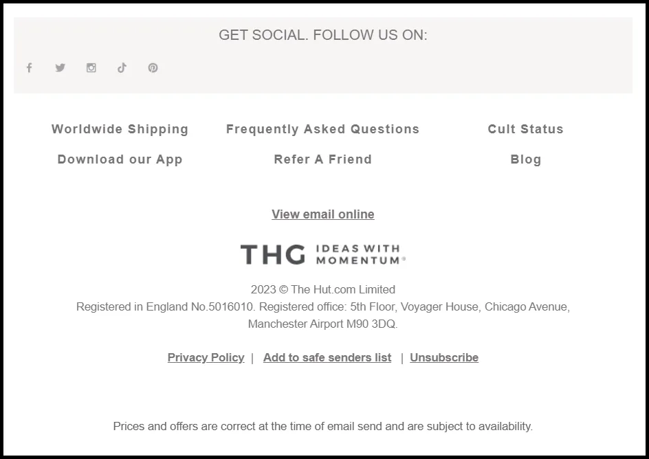
One thing to note about this example is the use of a clear call to action. By placing the “Refer a Friend” button near the top of the email footer and making it stand out with a different color or font, you can encourage more customers to take action and refer their friends.
Top email footer mistakes you need to avoid
Here are a few things to keep in mind when designing your email footer:
1) Making the footer too long: One of the most common mistakes that people make when designing an email footer is including too much information. While it’s important to include key information such as your contact details, social media links, and other relevant links, it’s important to keep in mind that your email footer should not take up too much space. When your footer is too long, it can look cluttered and overwhelming, and may even distract from the main content of your email. Instead, focus on including only the most important information and keeping the design clean and streamlined.
2) Not including a physical address: Depending on where your business is located, there may be legal requirements for including a physical address in your email footer. Even if it’s not required by law, including a physical address can help build trust with your recipients and demonstrate that your business is legitimate and trustworthy. Make sure that your physical address is accurate and up-to-date, and consider including additional information such as your hours of operation or a map to your location.
3) Not including a call-to-action: Your email footer is a valuable piece of real estate, and failing to include a clear call-to-action is a missed opportunity. Your call-to-action could be anything from a link to your website or social media profiles to a button that encourages recipients to sign up for your newsletter or follow your blog. By including a clear call-to-action, you can increase engagement with your brand and drive more traffic to your website or other online platforms.
4) Linking to irrelevant content: When including links in your email footer, it’s important to make sure that they are relevant to your brand and your audience. Don’t include links just for the sake of having them – they should provide value to your recipients and help reinforce your brand messaging. Additionally, make sure that any links you include are up-to-date and working properly, as broken links can reflect poorly on your brand and detract from the user experience.
Remember, your email footer is an important part of your overall brand identity, and taking the time to design it properly can pay off in the long run.
Postscript
A well-designed email footer can have a significant impact on your brand’s image and success. By incorporating key elements such as a physical address, call-to-action, and links to relevant content, you can improve the overall appearance and credibility of your emails, while also establishing trust with your audience.
By taking the time to optimize your email footer, you can create a more engaging and impactful email marketing campaign that resonates with your audience and drives real business results. So why wait? Start designing your email footer today taking inspiration from the various examples provided by top brands and seeing the difference it can make for your brand.
FAQs
1) How do I add an email footer to my emails?
The process for adding an email footer to your emails will depend on the email service provider you’re using. However, most email providers will have the option to add an email signature or footer within the email settings. Look for an option to create a new signature or edit an existing one, and then add the content you want to include in your footer. Once you’ve saved your changes, your email footer should automatically appear in all of your outgoing emails.
2) How do I customize my email footer to include company branding?
To customize your email footer with your company branding, start by choosing the fonts, colors, and imagery that align with your brand’s visual identity. You can also include your company logo or other branding elements to reinforce your brand’s identity. Make sure to also include a call-to-action or links to relevant content that aligns with your brand’s goals and values.
3) What information should I include in my email footer?
There are several key pieces of information you should consider including in your email footer, including your physical address, phone number, and email address. You may also want to include links to your social media profiles, a call-to-action, and links to relevant content or resources. It’s important to ensure that the information you include in your email footer is relevant to your brand and your audience and that it helps to establish trust and credibility with your recipients.
You may also like
Essential resources for your success


