Your D2C Shopify store is an online shopper’s dream. You have done everything to bring a lot of people to the webstore, but somehow people are abandoning their carts at the last moment. And you are trying hard to identify what the problem could be when someone opines ”Will checkout optimization help?”And you respond, ”What is that?”
What is Checkout Optimization in Ecommerce?
Checkout optimization is the strategy for increasing an online retail store’s conversion rate. The idea behind checkout optimization is to remove distractions and reinforce trust throughout the checkout flow so that the customer does not abandon the cart in your Shopify store.
Top Reasons for Checkout Abandonment
Checkout abandonment is the unwanted guest haunting the marketer’s house, the one they wish would just go away. Some of the reasons for cart abandonment are:
- High additional and hidden costs revealed during the checkout flow
- Forcing your customers to sign up when they don’t want to
- A very complicated and long checkout flow
- Lack of trust in the website, probably due to suspicious nature
- Frequent crashes on the website
- Shipping options that make for a delayed delivery
- Unclear return policy
- Lack of express checkout options
- Problems with the payment gateway
These are summarized in the image below which clearly indicate what the major contributors to checkout abandonment are. We recommend fixing these before we go ahead with this article. Once you have fixed these, you are ready to learn something that will help you hit the hoop with every throw. Here are 25 strategies for checkout optimization that will change your marketing game forever.

Strategies to Improve the Checkout Page
1) Have a mobile-friendly design
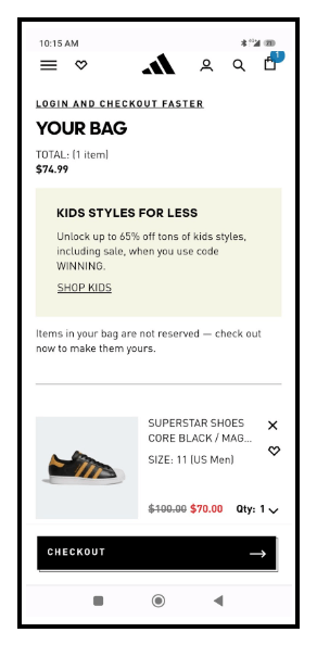
A mobile-friendly design is a center upon which a great checkout experience revolves. A great example is the one from Adidas below:
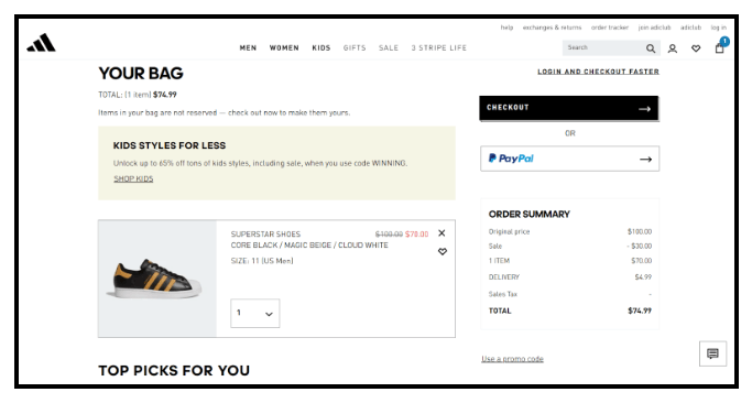
The first pic is that of their webpage where the checkout flow begins. They have a neat promo that they have advertised for kids. Notice how in the mobile version they have maintained all the vital information within the screen, the user having to scroll down only if he/she opts for Paypal. This is an example of great responsive design, and the user can checkout without scrolling down.
2) Offer guest checkout
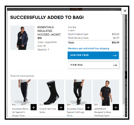
Not all shoppers want to give out their vital information. Wishes on birthdays can wait for such shoppers! They would just like to reveal only those details that would lead to successful order completion. Adidas also offers a guest checkout. The catch is that members get free shipping while others do not. Now that can be compelling! Great marketing.
3) Provide multiple payment and shipping options
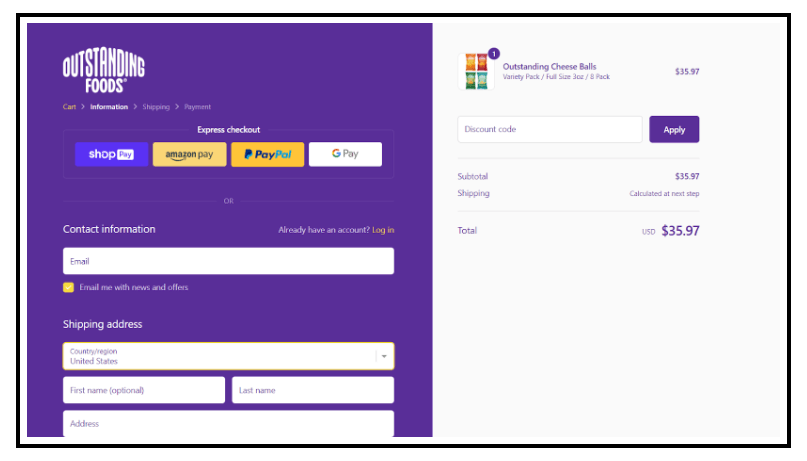
International shipping is a great way to reach a global audience that values quality. But everyone is expecting the best bang for the buck. That means payment options that have lower gateway charges and shipping options that are more convenient (not necessarily cheaper if it takes a long time or is risky!). Let the customer decide. Offer multiple payment options such as ShopPay, Amazon Pay, PayPal, and Gpay.
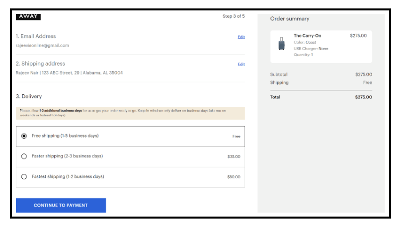
Also offers multiple shipping options. Let the customer decide if they want to pay for premium shipping. And when you get a premium product and the shipping’s free, such as this luggage from Away, it may be just what secures the deal. A customer could still opt for really fast shipping (just 1-2 days) by paying an extra US$50.
4) Allow social log-in to speed up registration
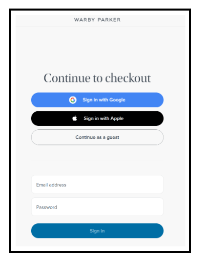
Warby Parker is a brand that is absolutely crushing it on social media. And so it is good reasoning to also provide social logins for a speedy checkout. With both Google and Apple logins, they’ve got both Android and iOS covered, and nobody misses out. The customer could opt to continue as a guest too.
5) Use error notification
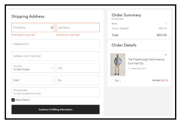
Intelligent error notifications actually can make navigating the checkout flow a breeze. Customers want to know why they are wrong and what fields are optional as well. Some customers may be wary of providing certain details. Allowing such fields to remain optional is a good step. At the same time, all the fields that are necessary for the completion of the purchase must be validated. DTC golf wear brand Bonobos has a well-thought-out checkout flow, providing a notification to warn the customer when certain fields are missing or incorrect.
6) Take advantage of 1-click checkout
1-click checkout can save your customers so much time. Some sites like Welly, known for its wonderful smoothies, call it Express Checkout. And they offer multiple payment options for an express checkout flow. Express checkout also allows your customers to not provide their email addresses or phone number. That’s smooth (pun intended) and very well done, Welly!

7) Display security badges
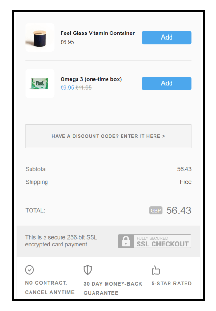
Allow the customer to feel safe and secure with the purchase made. Increase the trust the customer has in the website. When you display security badges in the e-commerce checkout flow, it means that you are partnering with payment providers that can be trusted. The customer’s data is encrypted end-to-end and safe. Here’s what security badges look like on UK-based DTC wellness brand Feel’s website. And they would make any customer feel safe!
8) Show the checkout flow
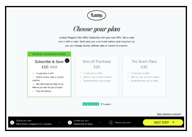
Let the customer know what to expect. Fussy, the sustainable deodorant brand wants its customers to be fussy. With a checkout flow clearly setting out three different plans, the brand allows the user to pick between a subscription option or a one-off purchase each with its own checkout flow. How can one not get Fussy on getfussy.com? (pun intended)
9) Cross-sell and upsell
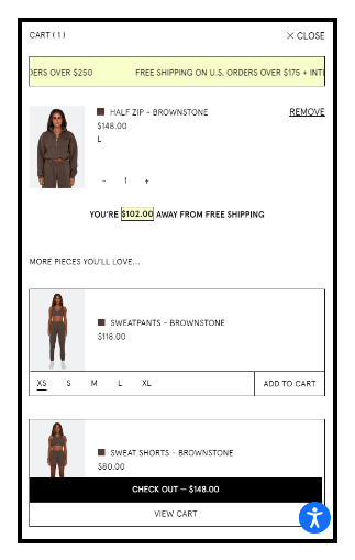
Take a card or two from Set Active’s deck, the activewear brand that gets it right when it comes to cross-selling or upselling. When buying a half-zip sweat top, the customer is immediately prompted to buy matching pants as well. If someone fancies shorts, this option is also available. To make a successful cross-sell or upsell always:
- Make data-driven personalized suggestions
- Educate the customer if the situation demands it
- Provide a way to visualize how it adds value
- Explain how others have found value
10) Reduce form fields
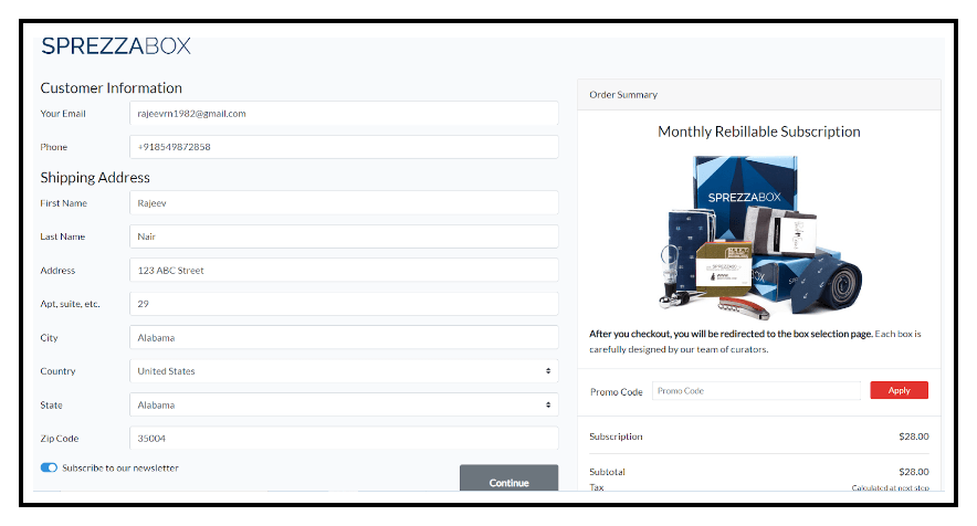
Frugality pays dividends and where it is most observed is clear, short, precise, and personalized messaging for your brand. And frugality in the checkout flow, specifically by reducing form fields, makes it much more convenient for the customer. Take this example of SprezzaBox, a men’s grooming wear brand that offers subscriptions. Note how there is no billing address. There’s only a shipping address throughout the checkout flow because they are capturing the customer’s email and mobile number. This will make checkout a whole lot easier for everyone.
11) Disclose shipping costs and time
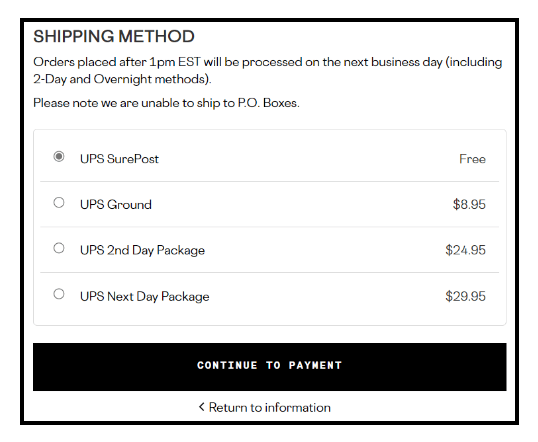
Being transparent with shipping costs will help:
- Achieve higher customer satisfaction (CSAT) scores by setting expectations
- Improve customer retention and lead to repeat purchases
- Reduce the risk of dissatisfaction or litigation
- Fulfillment and completion of order and avoid delays
In the above example, the customer has a number of options to choose from, the slowest being UPS SurePost and the fastest being UPS Next Day (1 day). Now, what would you pick as a customer?
If you want to learn more about optimizing shipping strategy then continue reading our blog: 7 Ecommerce Shipping Best Practices You Need to Know.
12) Autofill shipping information
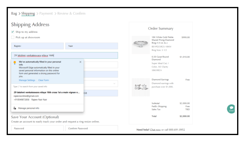
Looking to get engaged as soon as possible. We know how it feels, and it could be a nightmare to have to wait at an online store for an engagement store, just because there’s so much information to type in. Don’t you just wish then that someone would autofill your address information, so you only have to pay directly? Yes, absolutely. Auto-filling shipping information helps
- Customer focus on other aspects of the purchase
- Provide the marketer opportunities to make a quick cross-sell
- Customer check for hidden costs
- Customer add more customization
Brilliant Earth shows off some real brilliance in the checkout stage by auto-filling shipping information using the browser data. Such simplification will keep the customer forever, just as diamonds are.
13) Offer a wish list
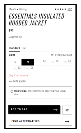
Sometimes the customers are just looking at the available options before considering a purchase. In such a case, the ability to save items can change the marketing game in your favor. Adidas accomplishes exactly this on its shopping website and even provides alternatives that are affected by what is added to the wishlist and bag.
14) Offer last-second discount codes
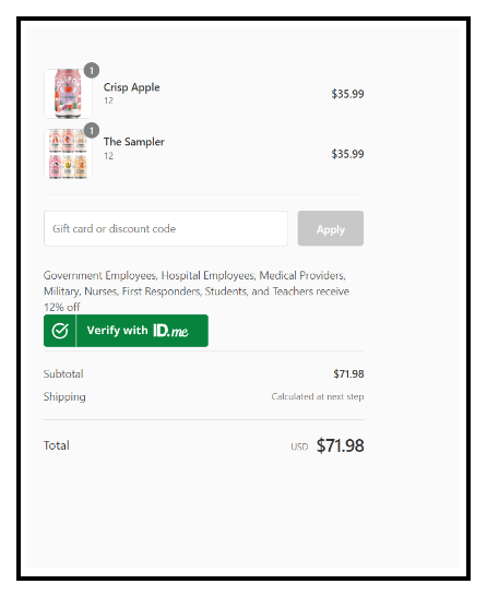
Offering a timed promo code towards the end of the checkout phase creates FOMO and helps complete a sale. Olipop, a DTC beverages brand, offers a last-second discount code for government and hospital employees, military, nurses, first responders, etc. It’s only 12% and they still do have to confirm their identity with ID.me, but this is unexpected and it would make any customer feel special.
15) Consider single-page checkout
There is nothing more deterring than having to click through several pages once the customer has decided to buy something. A single-page checkout will:
- Reduce the number of clicks
- Improve customer confidence
- Increase the probability of purchase
- Increases the likelihood of an upsell or cross-sell, thanks to flexibility if alternatives are provided on time
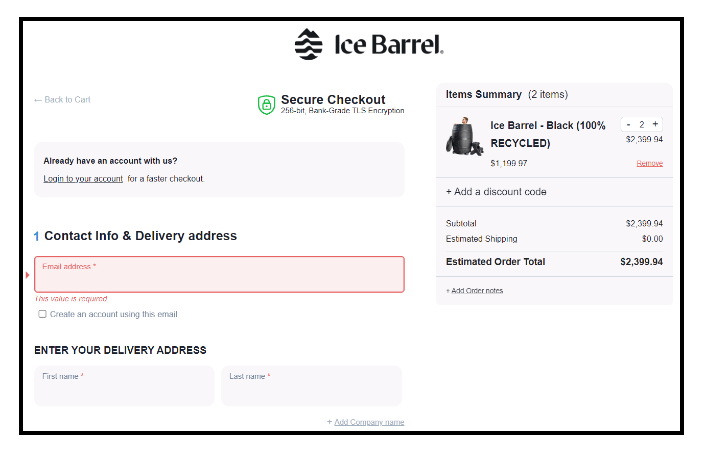
Ice Barrel breaks through the ice with a single-page checkout that will make the competition so hot with envy they might actually need an ice barrel.
16) Highlight customer reviews on the cart page
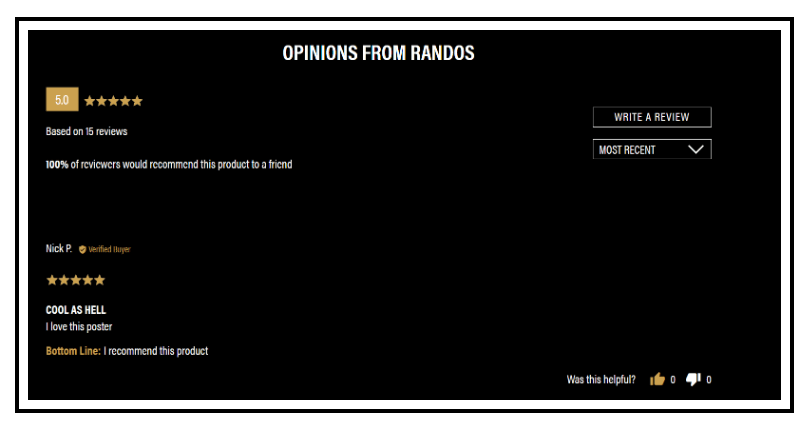
Relying on testimonials online might be the only way for a customer who’s not heard of the product from anyone in person. A testimonial is equally authoritative, as it can be shared only by someone who has bought and experienced the product. Seeing a review on the add-to-cart page just gives a customer the confidence to go through with the purchase. And having customer reviews gels well with Liquid Death’s unabashedly rude, frank, and outspoken vibe of ”Let the customers do the talking, why would we?”.
17) Highlight savings
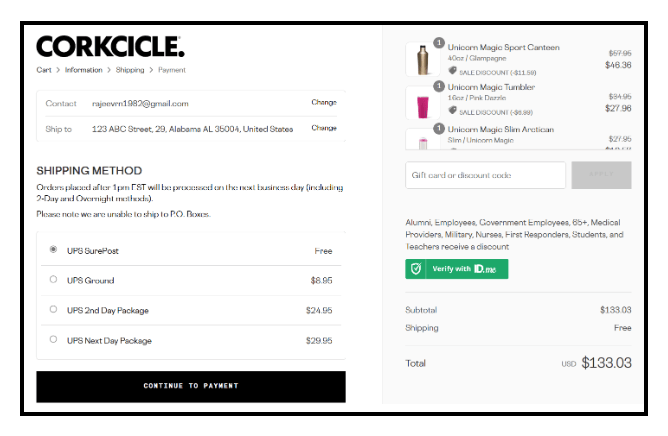
During the checkout, make sure you highlight how much the customer has saved. Corkcicle manages to do this elegantly by highlighting how many dollars have been saved on each item. This delights the customer when he realizes he has saved up to US$11 and there have been savings of at least US$7 on everything else on just an order of five high-quality bottles.
18) Leverage FOMO and urgency
We live in a connected world, and when there is a great deal, there’s always a fear of missing out on any eager shopper out there. Black Fridays and Cyber Mondays are days specially made for such announcements by brands. Fashion Nova is known for running such deals on special days and getting customers on the edge of their seats with massive discounts.
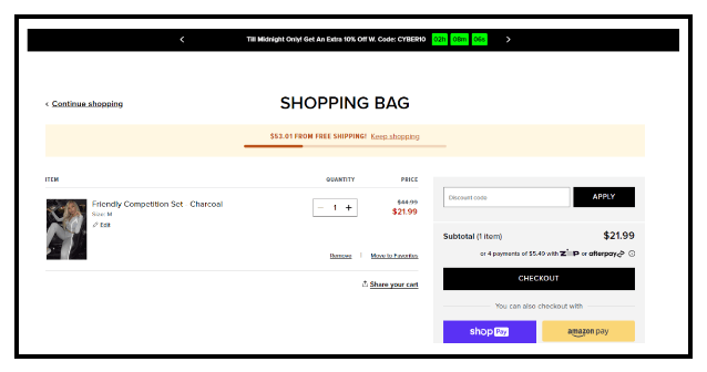
19) Auto-save cart contents when abandoned
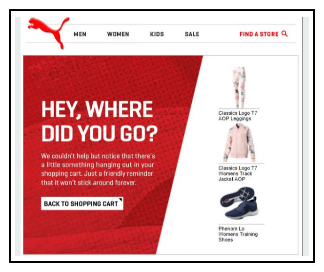
When the customer abandons the cart, an exit intent popup will appear which will offer a promo code to complete the purchase. If the customer leaves the browser, the cart would be saved by the brand and a cart abandonment email would be sent out. Look at this example by Puma. The message is both humorous and very endearing. All the items abandoned by the customer are mentioned in the mail for easy recall. Sometimes a discount code or free shipping on the order is also offered in the mail.
20) Include gift wrap/message options
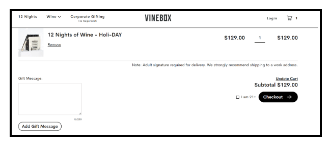
Gift wrapping the order and adding in a gift message is a feature one would desire especially when it comes to products that are identified by their fantastic experience. How about a box of wine samples? That would be a great gift. Adding in a message and gift wrapping is what Vinebox lets customers do, and there’s also that cheeky little confirmation (Are you over 21?)! Three cheers to that!
21) Give away complimentary samples with each order
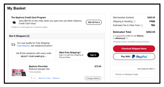
A free ride on a rollercoaster. Who would say no? Now, how about two free rides? That’s heaven. Sephora gives away two samples for its customers on orders exceeding a certain value. And the free shipping added to it is just the icing on the cake.
22) If no upsell, then down-sell
Sometimes it is better to down-sell if the upsell does not work. The user can always remove an item from his shopping cart at a later point in time. So provide additional options during the checkout phase. This will allow you to keep your customer even if they do not want the item. Samples also help keep the relationship with the customer alive.
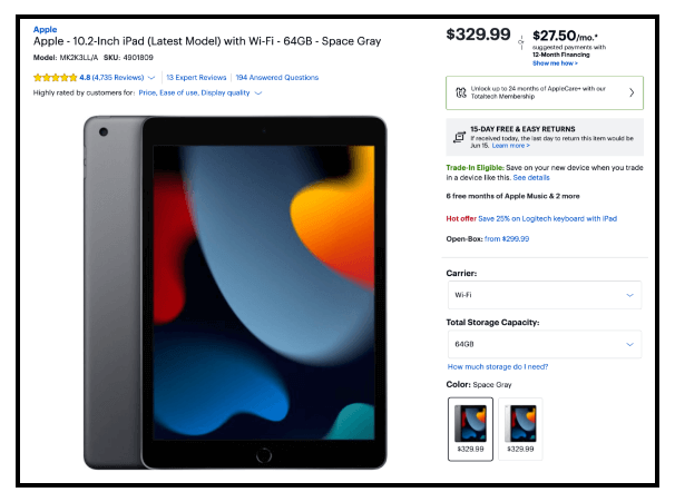
For example, BestBuy, one of the largest electronics online retailers in the world, always provides a variety of choices to keep customers on their page. We can see that BestBuy has an iPad listed for $329. We can also clearly see a $299 open-box offer. This indicates that the customer wants an iPad as a more economical alternative. They can spend about $30 less on an open-box item. There is, however, a crucial component in this. The open-box version is not aggressively emphasized in the pitch. The consumer would notice the retail item if you did this. However, a customer seeking a different offer can still see the open box option without any trouble.
23) Use a clean design and remove distractions
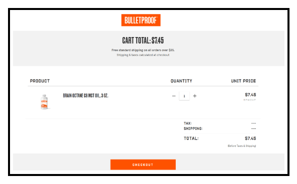
A customer makes the purchase but realizes that the checkout page is looking too busy or that the design is not clean enough. While it may be okay for a checkout page to look a bit busy, if the design is off then it takes away from the winning feeling of purchase that the customer has. Bulletproof uses an orange and white design to give the energy vibe of coffee and keeps it simple and compact as well, with no fluff at all. Now that’s a bulletproof checkout if you ask us. Nothing wrong with it!
24) Provide 24/7 customer service, and a 365-day return policy
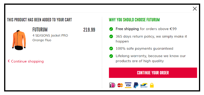
Providing a great checkout experience will help you secure customers but it is after-sales service that will keep them for a lifetime. Provide a 365-day return policy if you can and if your products have a shelf life of several years, and 24/7 customer service too if you are a luxury goods brand. These will help inspire confidence in a purchase and keep your customers for a lifetime.
A great example of such impeccable customer service backing high-quality products is Futurum, a cycling gear DTC brand.
25) Test, test, and test
Trial and error is the solution to several problems that are deemed unsolvable by other means. Keep updating and split A/B testing the checkout flow. Change such things as the fonts, the size of the buttons, the messaging, and payment options. This will help in perfecting the checkout flow.
Best Checkout Page Examples
1) Nike
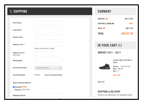
Nike’s online checkout meets most of the best practices. Their design makes it easy to enter as a guest, a member, or through a social login. The checkout is set apart, and the header menu is taken away, so there aren’t many distractions. Once a customer starts paying, they are simply led through the process. Support is also easy to reach, and call-to-action buttons are clear.
2)) Sephora
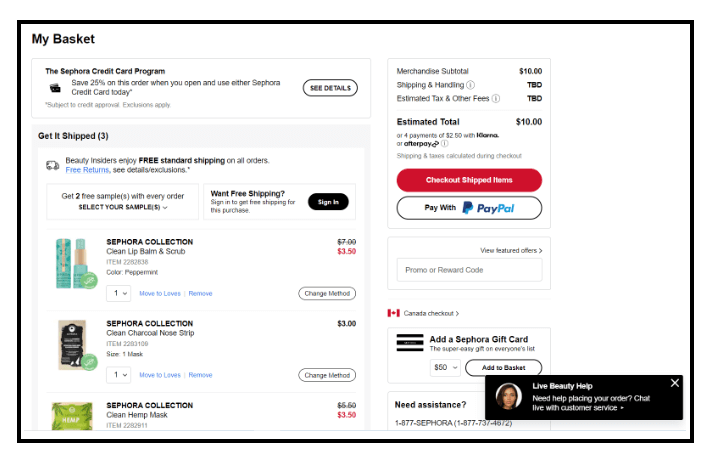
There are several reasons why the checkout page from Sephora stands out. It’s a glittering example of checkout optimization.
- The flexibility of being able to pay under their credit card program
- Free shipping and returns on all orders for Beauty Insiders (their insider program)
- A dedicated person waiting to assist you with checkout on live chat
- A phone number for further assistance
- Global checkout options that provide further flexibility
- An option that lists other related products the customer may want
Their near perfect optimization of the checkout flow, apart from their much-acclaimed cosmetics of great quality, may be a reason why Sephora is leading the pack in beauty today.
3) Infinite CBD
Infinite CBD is a seller of therapeutic products that make use of CBD(Cannabidiol). This page from Infinite CBD uses light colors, with not too much contrast. Even their checkout page is quiet, peaceful, and in a way very zen-like.
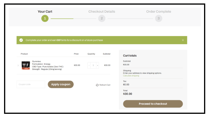
The numbers at the top for specific points in the journey lets the customer know exactly how long it is going to take to checkout – not too much time at all! The customer could be happily looking forward to his gummies in a couple of minutes at most. No nudges to view other products, which again makes for a very clean design here. I would definitely checkout without a moment’s hesitation and be on a high!
4) Allbirds
It’s there in the brand name. Sustainability is what Allbirds is all about. Made from natural and biodegradable materials entirely, their shoes are also made for several use cases. We love their checkout flow because
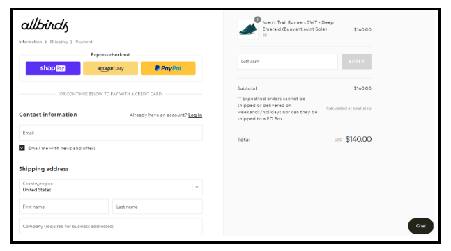
- They offer the popular options for one-click checkout.
- There’s a possibility to chat and make sure the customer is getting what they need.
- Customers can opt out of email if they want to, and there is no popup to join their mailing list either.
- Customers get points for every purchase, which they can use for other purchases.
5) Casper
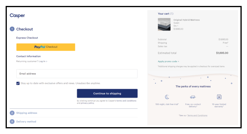
We all know an old friendly ghost who is all white and soft and just loves to play. There’s also a brand of mattresses that are just as warm and cozy to lie down on by the name of Casper. Casper’s winning strategy has been their 100-night risk-free trial. A brand that is confident ought to be selling great stuff, or at least you would think so as a customer. Oh yes, and we forgot to mention the 10-year protection plan, which they advertise even at checkout! They do not miss out on cross-sell either. A customer’s got to love a little glow lamp in the morning to wake him/her up from the lull of sleep!
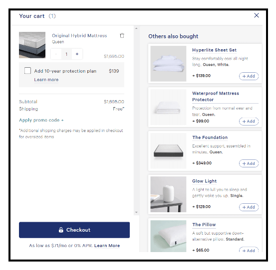
The express checkout flow with Paypal is a timesaver too and the 10-year limited warranty advertised and the safety of returns just seal the deal for us.
Conclusion
Customers can’t check things out if they don’t check out! Provide the customer with the incredible power of choice if you have to in the selection process with great recommendations, but keep things simple in the checkout phase. The checkout flow is arguably the most important part of the buying process, so it will pay off, in the long run, to keep improving it.
Improving the checkout flow is a long and ongoing process. These best practices will help you get started, and then try different things to see what works. By the way, did you know that you could optimize the checkout flow further by understanding customer behavior and buying preferences? Moda is a great customer data platform that makes this possible for marketers like you! Signup for Lifesight today!
You may also like
Essential resources for your success
