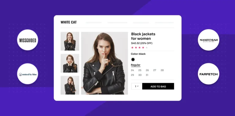
A key component of raising your e-commerce conversion rate is by product page optimization. Even if you have the best products, the easiest checkout process, the most successful Google advertisements, and more traffic than any of your rivals, your product pages won’t be designed to impact and drive conversions, leaving shopping carts empty in the wake of your website visitors.
Just like real-world trial rooms, customers consider ecommerce product pages to be just as important and alluring. Did you know that 53% of customers believe that product reviews and content is the most critical determinant when making an online purchase decision since they cannot touch or physically examine the item? You must design your product pages wisely if you want to encourage customers to purchase your products. Every step you take needs to be deliberate, from the phrases you use to the images you choose to the layout you offer to the shopping experience you develop for your website visitors.
All ecommerce product pages should be intuitive and easy to use. The major objective of your product pages is to increase customer confidence by providing all the details required to make a purchase choice, making the process simple to follow, and preventing user confusion.
You need to be familiar with the following four components for building an excellent ecommerce product page:
- Product
- Brand
- Copywriting
- Design and user experience
In light of this, let’s delve into the elements that can help you enhance your product page and ensure the success of your ecommerce store.
12 Elements of a high-converting product pages
1) A product title that hits the right chords
A product title identifies the item and informs your customers of what they are viewing. Make an effort to be as detailed without being unnecessarily confusing. It is a unique, eloquent title that raises customer perceptions of the worth of the product. The text for the product title has to be large, easy to read, and alluring at the same time.
Make sure each product page’s title tags are distinct for SEO purposes. You can include the title, the brand, the model, the type of product, etc. in your titles to ensure that each page is distinct and captivating.
2) Include high-quality product images and videos
The initial impression your customers get of your brand is created by high-quality images. High-quality product images are crucial in e-commerce since people make decisions about what to buy and consume visually. Your product images should reflect reality accurately and be well-lit.
Consequently, one of the fundamental guidelines for ecommerce product pages is to feature images that can be zoomed in and out. Giving visitors a comprehensive view of the products by using many images taken from various angles gives the product an extra edge.
3) Provide a 360-degree product view
Even if your customers aren’t inside your actual store, you can still provide them with a 360-degree picture of your products. 360-degree images are very interactive and enhance the visual appeal of your page. Everyone enjoys them!
They have been demonstrated to boost conversions, minimize returns, and increase traffic to your website. Even though they can be expensive and difficult to shoot, if you can fit them into your budget, they can improve your revenue.
For example, Rolex is the epitome of luxury watches and for many people, it is a once-in-a-lifetime purchase. Rolex doesn’t just offer its customers a nice view of its luxury watches. Instead, they offer a 360-degree view of the watch at a pace that allows you to inspect every aspect of it before making a decision, with captivating lighting for dazzling reflections.
4) Provide an SEO optimized product description
A key weapon in your e-commerce selling arsenal is the product description. You will inevitably lose out on clicks and transactions if your product descriptions are ineffective. Concentrate on your ideal customer and engage them with words and product descriptions that speak to their objectives and difficulties. Customers will feel that you understand who they are and what they need from you if you do this, and as a result, they will be more confident in their decision to do business with you.
Make it simple for customers to find your products among the many competing offerings. To identify the buzzwords for your product pages to rank in search results, conduct a thorough keyword study. After choosing your product page keywords, it’s time to strategically place them on the page. They must be included in title tags and meta descriptions for your ecommerce product page to be optimized.
Your page title and meta descriptions must be distinct, concise, and keyword-focused. For higher impact, include the keyword and your brand name together at the beginning of the title. You can include symbols and numbers in your descriptions to get more clicks.
5) Design attractive CTA buttons
The call-to-action (CTA) button would be near the top of any list of the critical elements of ecommerce product pages. To use them effectively, you must descend into the deepest knowledge caverns of UX. The color, size, shape, and placement of a button all have a significant impact on how clickable it is.
Buyers are persuaded to make that specific purchase right away by a psychological trigger, such as an obvious Add to Cart or Buy Now button. It’s important to be able to quickly draw the user’s attention to this button. The power of color is enormous. Even at first glance, they can assist you in conveying messages.
However, in many countries and cultures, distinct colors may signify lots of things. In various cultures, certain things are symbolized by various colors. There are two things to take into account while choosing a color. First off, consider whether your target audience feels the way you want them to. And secondly, how does it differ from the rest of the page’s color scheme? The CTA should stand out in the best-case scenario to attract customers’ attention.
6) Build your brand by adding social proof
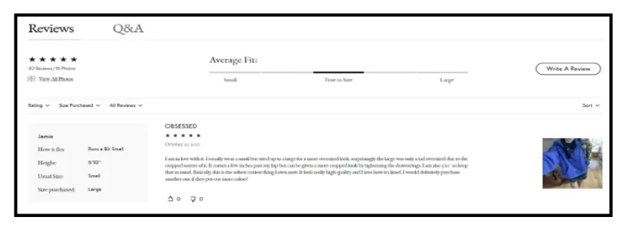
Nine out of ten customers, on average, read numerous product evaluations before making a purchase, and including them on your website can increase sales by up to 18%. Social proof is a cornerstone of the best CRO tools and can completely transform your conversion rates. Hearing positive reviews from other buyers will do more to persuade a prospective customer to purchase a product. Social proof can take many different forms, including average star ratings, business accolades, and trust certifications.
“As trust is significantly influenced by social proof, it plays a significant role in e-commerce by both directly influencing intention to buy and indirectly influencing perceived usefulness.”
To sum that up: you need social proof on your product pages.
7) Offer an “Add to Wishlist” option
Naturally, some customers simply aren’t ready to make a purchase yet. But if you offer them a simple way to keep their purchase for later, your chances of making the sale will be substantially higher (rather than losing them to a competitor). Wishlists are a fantastic tool for this. The customer adds the product to their wishlist, which they can save and access at any time.
8) Cross-sells & recently viewed products
If a customer chooses not to purchase one of your products, you at least want them to browse as many other products as they can on your website. Presenting related items in the same price range with comparable specifications or different colors of the same product (if available) is a wonderful approach to that.
With products that can enhance their selection, these product recommendations add another dimension to your on-site approach, assisting you in further engaging and delighting your visitors.
9) Upsells
Offering higher-end products that are related to the item in this final portion of your ecommerce product page is another smart move. Product Upsell enables you to make and show suitable upsell offers and add-on products based on the contents of your shopping cart, the value of your entire cart, or a mix of both.
10) Offer live chat
Most of the time, consumers desire assistance but don’t actually want to talk to agents. It can be quite frustrating to call, navigate phone trees, wait on hold, and then explain a problem over the phone. The customer is already agitated when the customer service agent responds. When they see a live chat, 41% of online consumers have more confidence in the business. Live chat offers quicker reaction times and resolutions, improving the customer experience.
11) Add a FAQ section to resolve customer queries
After operating your e-commerce business for a while, you can certainly list some frequently asked questions about your products. However, have you ever considered how frequently consumers leave your website just because they don’t want to communicate with your chatbot or write you an email to allay their concerns?
Consumers can be kept on your ecommerce designed product page and turned into potential clients with the aid of an effective FAQ section. Furthermore, adding a FAQ section to your website can improve its search engine rankings. Be sure to mark up this section using structured data from the FAQ.
Common FAQs include:
- What unique service/product do you offer that gives you an edge over your competitors?
- What methods of payment are available?
- Are shipping fees included or additional?
- Do you accept exchanges or returns?
- What are the main distinctions between two identical products but different versions?
12) Create urgency with a countdown timer
Utilizing scarcity to convey the idea that items might not be available for visitors to purchase later, that special offers might not be available later, or that the price might change later is the final conversion rate optimization strategy for your product pages. In order to reduce the number of users abandoning their carts, the objective is to apply some pressure on visitors and encourage them to make a purchase decision more quickly and before leaving your website. Your special offer’s countdown to expiration, the introduction of a new product, the final two hours of free shipping, or the last three things in stock are all examples of urgency tactics.
The Countdown Timer plugin gives your product detail page a sense of urgency, which is a tried-and-true sales tactic. One quick and simple approach to convey to customers that they might lose out on the product they want is to highlight that it is in short supply or that many people are looking at it simultaneously.
5 Alluring Ecommerce product page examples you just can’t get enough of
It can be challenging to design high-converting product pages that convert well.
Fortunately, if you find yourself in a rut, you can always look at some product page templates to feel motivated and ready to begin working on your own product page.
So, here are the best product page examples that are impossible to ignore:
1) Outdoor Voices
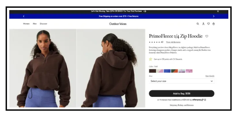
Athleisure clothing is the specialty of the brand Outdoor Voices. The brand uses pictures of playful and lively models on its ecommerce product pages to make its clothing appear approachable and credible.
Their product sites are attractive, effective, and comprehensive. Consumers can easily find product detail pages, characteristics, and different payment options without being diverted from the brand’s main objective, which is for them to click Add to Bag.
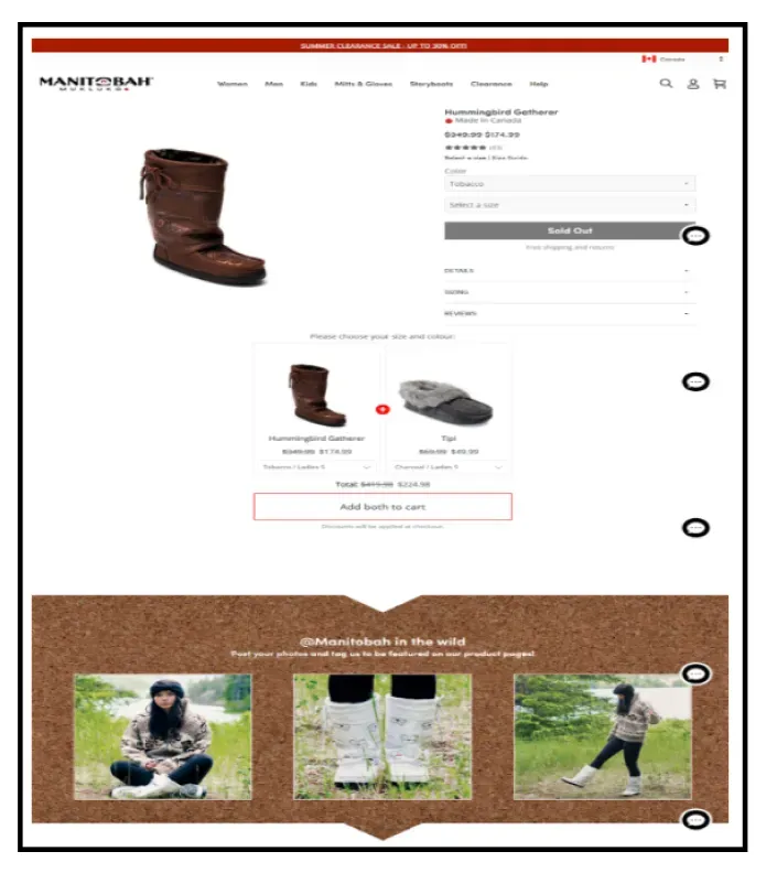
2) Manitobah
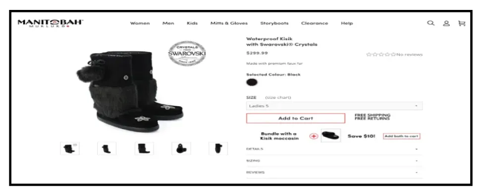
On the product page for Manitobah, “free shipping” and “free returns” are stated next to the Add to Cart button in large, bold characters in an effort to allay the most frequent purchase concerns. Without ever leaving the product page, the brand enables the cautious consumer to read up on the business and its goals at their own pace.
Their items’ aesthetic appeal and authenticity serve to communicate the brand’s narrative by elegantly articulating the company’s vision and objective. Along with the inspiration for the boots, it also recounts the tale of community development, which strengthens the value proposition of authenticity.
In addition, Manitobah excels in effective cross-selling and a one-of-a-kind social proof request to highlight its greatest deals and bundles. They use their Instagram profile to compile countless tags of customer reviews to include in the product page reviews.
3) Missguided
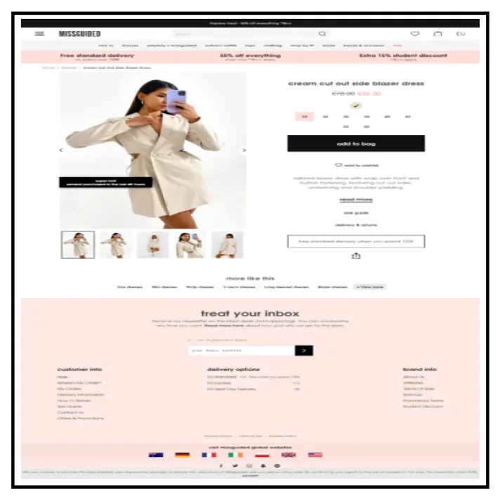
This ecommerce store offers stunning clothing that is incredibly appealing. They put a lot of effort into making sure the above-the-fold converts right away on their product page.
The deliberately placed above-the-fold on the ecommerce product page is a clear inducement to incite shoppers to feel a feeling of urgency and add the item to their shopping carts. Furthermore, they offer their customers a sizing chart to select from, which is followed by a clear CTA that directs you to the next step.
Furthermore, Missguided makes specific links for each customer query. The return policy, order tracking, and contact us buttons on these FAQs all link to articles that explain how to address these questions. In order to help consumers mentally compute their orders and checkout with a close estimate, they also provide transparent delivery charges. The number of abandoned carts in your store can be significantly decreased by these elements.
4) Farfetch
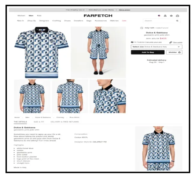
Modern designer clothing, accessories, shoes, watches, and other items are available for purchase through Farfetch’s designer catalog. Farfetch adopts a transparent strategy by utilizing the above-the-fold area to its maximum potential. They also introduce the scarcity approach by letting you know how few things are left in stock while offering enticing discounts. To ensure that the majority of customers add the goods to their cart, they finish it off by making the CTA bold and located just below the discount.
By inquiring about your prior purchases from other designers to assist estimate your size, Farfetch focuses on customer insights to deliver a cutting-edge customer experience. This is a fantastic way to get shopping insights from customers for future recommendations. It also helps to know what type of products your consumers are most likely to purchase.
Farfetch also employs a toggle and sections to make it easier for shoppers to browse product detail pages, review measurements, and other crucial information about shipping, returns, and warranty without having to scroll through. Potential customers will find it simple to return to the CTA as a result.
5) United By Blue
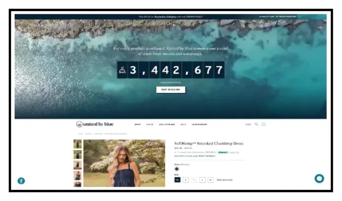
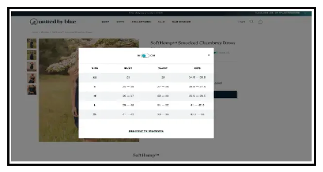
They are one of the most eco-friendly online retailers, is working to eliminate trash from the world’s oceans and rivers. You can see that it emphasizes how your purchase advances the organization’s progress toward this objective: “Every product purchased removes 1 pound of trash.” By informing prospective customers how they can support society by purchasing apparel, United by Blue creates a community with its products. They are focused on conveying their brand value, and sustainability, through their content. Moreover, it’s a terrific technique to entice potential customers to feel at ease enough to buy more clothing.
The product description, sizing information, and the ability for the brand to cross-sell and upsell other products are all provided by a simple interactive design that makes use of dropdowns and sections. All are designed to eliminate endless scrolling.
Postscript
Ecommerce websites are adored by users that speak directly to them. Understanding the wants and expectations of your customers will help you design a successful e-commerce website that meets their needs. One of your biggest chances to sway customers’ buying decisions is through your ecommerce product pages. You will benefit from increased sales and contented customers if you take the time to make them as effective as feasible.
Thousands of e-commerce stores have put the aforementioned advice to test. But it does not imply that you put each of these concepts into practice without first testing them on your own website. Each e-commerce store has a unique target market, selection of products, areas of expertise, etc. To develop a high-converting product page, there is no right or wrong way to do it. With the 12 tested tactics we’ve listed above, you should be well on your approach to increasing the conversion rates of your product pages. It takes trial and error—sometimes lots of it!—but you should be well on your road to success.
You may also like
Essential resources for your success
