Although online shopping is becoming more popular, not all website visitors end up making a purchase. With online shoppers abandoning an estimated 55-80% of their browsing sessions, it’s more important than ever for businesses to make the most of these missed opportunities.
Fortunately, there is a solution: browse abandonment emails!
These nifty emails swoop in to remind those “window shoppers” about the awesome stuff they left behind on your site.
Recent studies indicate that browse abandonment emails have an average open rate of 41.18% and a click-through rate of 9.5%. So, if you’re on a mission to pump up your ecommerce sales, these emails are your secret weapon.
We understand that crafting the perfect browse abandonment email can be challenging. That’s why we’ve put together this comprehensive guide to help you through the process. From subject lines to email copy and design, we’ll cover everything you need to know to create effective browse abandonment emails. So, let’s get started and help you recover those lost sales!
Browse abandonment email examples that stand out
1) Something Navy
Subject line: “We shopped for you”
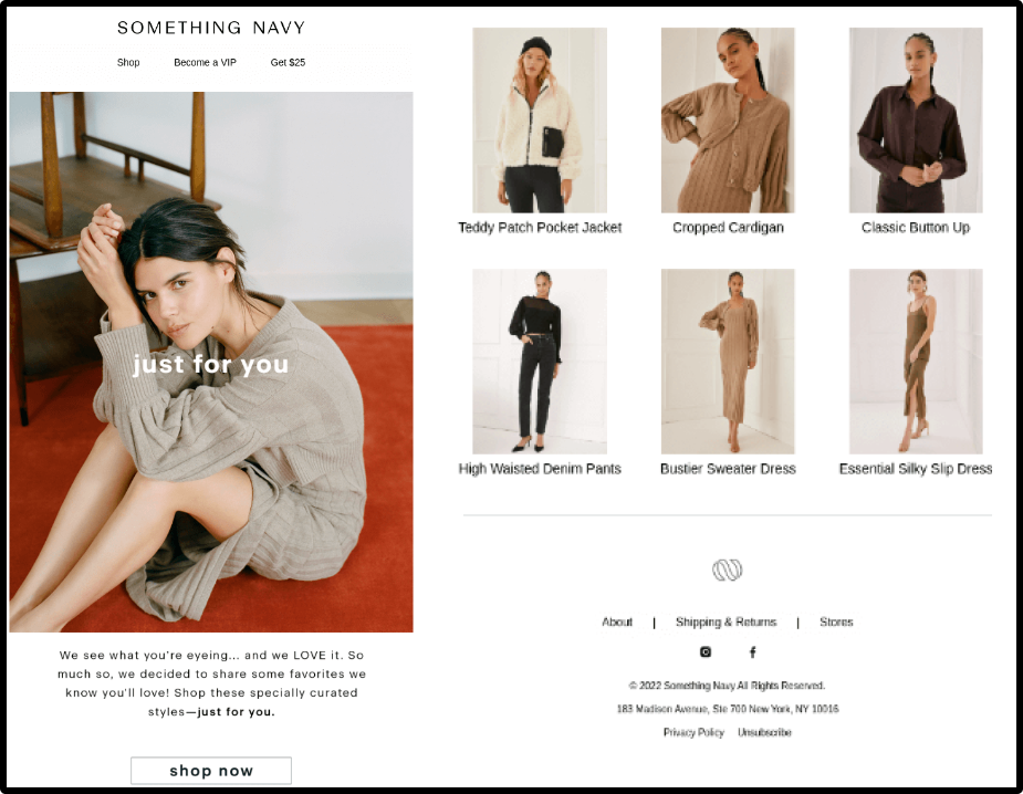
Something Navy’s browse abandonment email stands out because of its personalized approach. Their subject line, “We shopped for you,” immediately catches the reader’s attention and conveys a sense of helpfulness. It creates a feeling of exclusivity as if the reader is receiving special treatment.
Something Navy uses a simple and clean design with a clear call-to-action (CTA) button. The email features an image of the product that the reader was browsing, reminding them of what caught their interest in the first place. The copy is also personalized, using the reader’s first name to create a sense of connection and familiarity.
If you’re struggling to come up with ideas for your own browse abandonment emails, these three elements – an image of the abandoned product, a link to shop now, and product recommendations – are a great starting point. By incorporating these elements into your emails, you can create a personalized and effective message that encourages readers to return to your website and complete their purchase.
Lifesight Tip: Use a catchy subject line, clear design, and personalized copy make to the customer feel valued and motivated to complete their purchase.
2) On
Subject line: Don’t miss out!
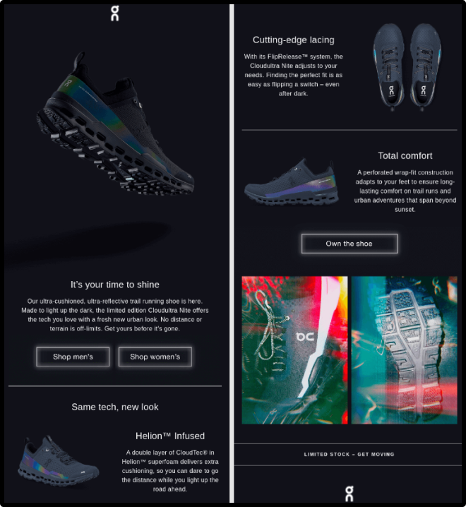
On’s, browse abandonment email is effective because of its sense of urgency conveyed in the subject line. Using phrases like “don’t miss out” and “get” creates a sense of immediacy and encourages the reader to take action.
On uses bold and eye-catching design elements that highlight the Cloudultra Nite product. The copy is simple and to the point, highlighting the features and benefits of the product. The email also includes a clear call-to-action button that links directly to the product page, making it easy for the reader to complete their purchase.
Lifesight Tip: Create a sense of urgency and encourage readers to take action. By using bold design elements and clear copy, you can make it easy for the customer to understand the benefits of the product and take action to purchase it.
3) Mode Chocolate
Subject line: 5 reasons to try Mode
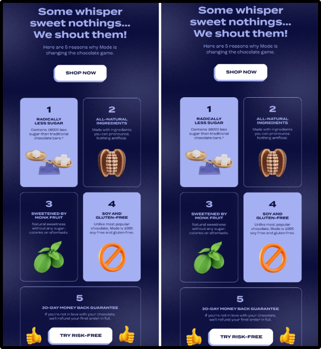
Mode Chocolate’s browse abandonment email stands out because of its unique approach. Instead of solely focusing on the product that the reader abandoned, they use the opportunity to showcase the overall benefits of their brand.
The subject line, “5 reasons to try Mode,” immediately piques the reader’s interest and encourages them to continue reading. In the email itself, Mode Chocolate uses a simple and visually appealing design, featuring high-quality images of their products.
The copy in the email highlights the five reasons the reader should try Mode Chocolate, including unique flavors, ethical sourcing, and a commitment to sustainability. The email also includes a clear call-to-action button that links to their online store, making it easy for the reader to browse their products and make a purchase.
Lifesight Tip: Take a unique approach and showcase the benefits of your brand. By highlighting their unique selling points and using a visually appealing design, you can create a compelling message that encourages the customer to try your products.
4) Brooklinen
Subject line: Did life get in the way?
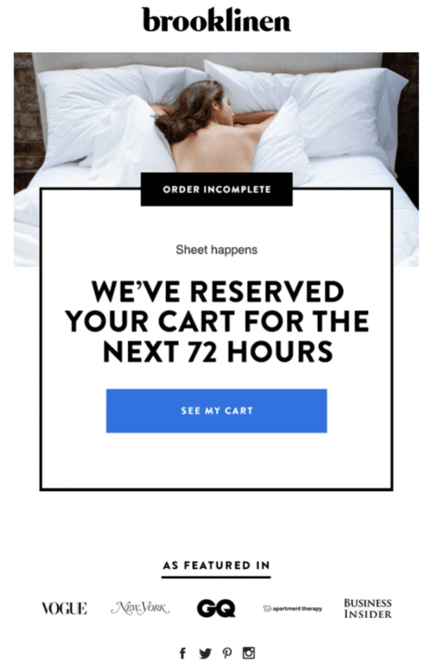
Brooklinen’s browse abandonment email stands out because of its empathetic tone and attention to detail. The email starts off with a friendly message that acknowledges the reader’s busy life and encourages them to come back to complete their purchase.
Their subject line, “Did life get in the way?”, is effective because it acknowledges the reader’s busy life and offers a relatable reason for why they may have abandoned their purchase, while also creating a sense of curiosity and encouraging them to return to the website. The email includes a section with customer reviews of the abandoned product, as well as a recommendation for a similar product that the reader may also be interested in.
It features a clear and inviting image of the abandoned product, along with a prominent call-to-action button that takes the reader directly to the product page on the website.
Lifesight tip: Use customer reviews to showcase the quality and popularity of your products.
5) Tuft & Needle
Subject line: “Hi there! Don’t sleep on this!”
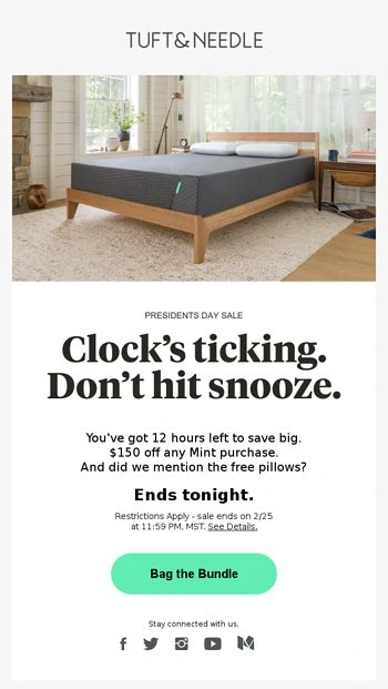
Tuft & Needle’s subject line is effective because it uses a friendly and conversational tone, while also creating a sense of urgency with the phrase “Don’t sleep on this!” The use of “Hi there!” also adds a personal touch that makes the reader feel like the brand is reaching out directly to them.
They also include a code for $50 off their purchase, which can be a powerful motivator for someone who was on the fence about buying the product in the first place.
The email features an image of the product the reader abandoned in their cart, along with a clear call-to-action button that says “Finish my order.” There’s also a section with customer reviews and a few other product recommendations in case the original product isn’t quite right for the reader.
Lifesight Tip: Use a discount code to incentivize customers to return to your website and complete the purchase.
6) Gymshark
Subject line: “We saved your basket!”
Gymshark’s subject line is effective because it immediately catches the reader’s attention by stating that their basket has been saved, creating a sense of relief that they haven’t lost the items they were interested in purchasing. This creates a positive association with the brand before the reader even opens the email.

The email features a prominent image of the product the reader abandoned, along with a clear call-to-action button that says “Go to checkout.” Additionally, there are a few product recommendations based on the reader’s browsing history, which can help encourage them to continue shopping and potentially add more items to their cart.
One of the standout features of Gymshark’s browse abandonment email is the use of social proof. The email includes a section that showcases customer reviews for the product the reader abandoned, which can help build trust and credibility with the reader and make them more likely to complete their purchase.
Lifesight Tip: To really up your game, include social proof and personalized recommendations in your email, just like they did.
7) Adore me
Subject line: “Did you forget something, [customer name]?”
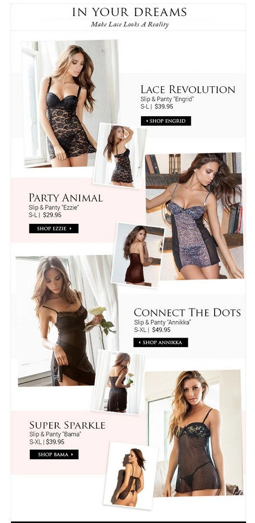
The subject line is effective because it includes the customer’s name, making the email feel more personal and less like a generic marketing message. The question “Did you forget something?” also creates a sense of urgency and prompts the reader to open the email to see what they left behind.
The email features a large image of the product the customer abandoned, along with a clear call-to-action button that says “Take me back.”
Adore Me also includes product recommendations based on the customer’s browsing history, which can help them discover new products and potentially make additional purchases.
One of the standout features of Adore Me’s browse abandonment email is the use of a discount code. The email includes a 20% off discount code that’s valid for a limited time, creating a sense of urgency and incentivizing the customer to complete their purchase.
Lifesight Tip: Combine personalization, urgency, and incentives for maximum impact
8) Huckberry
Subject line: “We’re not mad, just disappointed.”
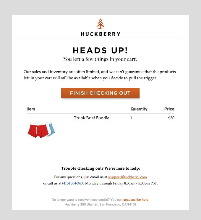
Huckberry’s browse abandonment email stands out because of its clever use of humor in both the subject line and email content. The subject line, “We’re not mad, just disappointed”, immediately grabs the reader’s attention with its playful tone and creates a sense of intrigue. This approach makes the customer more likely to open the email and engage with its contents.
The email features an image of the abandoned product, along with a personalized message that humorously reminds the customer of what they left behind. The witty language used in the email, such as “Let’s try this again” and “We’re not mad, just disappointed”, helps to create a light-hearted and non-confrontational tone that makes the customer feel at ease.
The email also includes a clear call-to-action button that links directly to the abandoned product page, making it easy for the customer to pick up where they left off and complete their purchase. Additionally, the email provides product recommendations that are similar to the abandoned item, giving the customer a chance to explore alternative options and increase the likelihood of a purchase.
Lifesight Tip: Use humor to create a memorable and engaging experience
9) Fossil
Subject line: “You left something behind + 15% off to get it back”
Fossil offers a variety of other accessories, including bags, jewelry, and small leather goods. The brand’s products are designed to appeal to a broad range of customers, from those looking for classic, timeless designs to those who prefer more modern and trendy styles.
Fossil is also known for its commitment to sustainability and has implemented several initiatives to reduce its environmental impact. The brand uses recycled materials in its products and packaging and has committed to sourcing 100% renewable energy for its stores and offices by 2025.
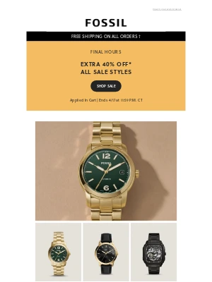
The subject line is effective because it creates a sense of urgency and offers an incentive for the customer to complete their purchase. The email itself features an image of the abandoned product along with a personalized message that reminds the customer of what they left behind and encourages them to come back and complete their purchase. The email also includes a clear call-to-action button that links directly to the abandoned product page, making it easy for the customer to pick up where they left off and complete their purchase.
Additionally, Fossil offers a 15% discount code as an incentive for the customer to complete their purchase, which is prominently displayed in the email.
Overall, Fossil’s browse abandonment email is a great example of how to use incentives and personalized messaging to encourage customers to complete their purchases.
Lifesight Tip: Highlight brand values and offer incentives to encourage purchases
10) Rothy’s
Subject line: “Left something behind?”
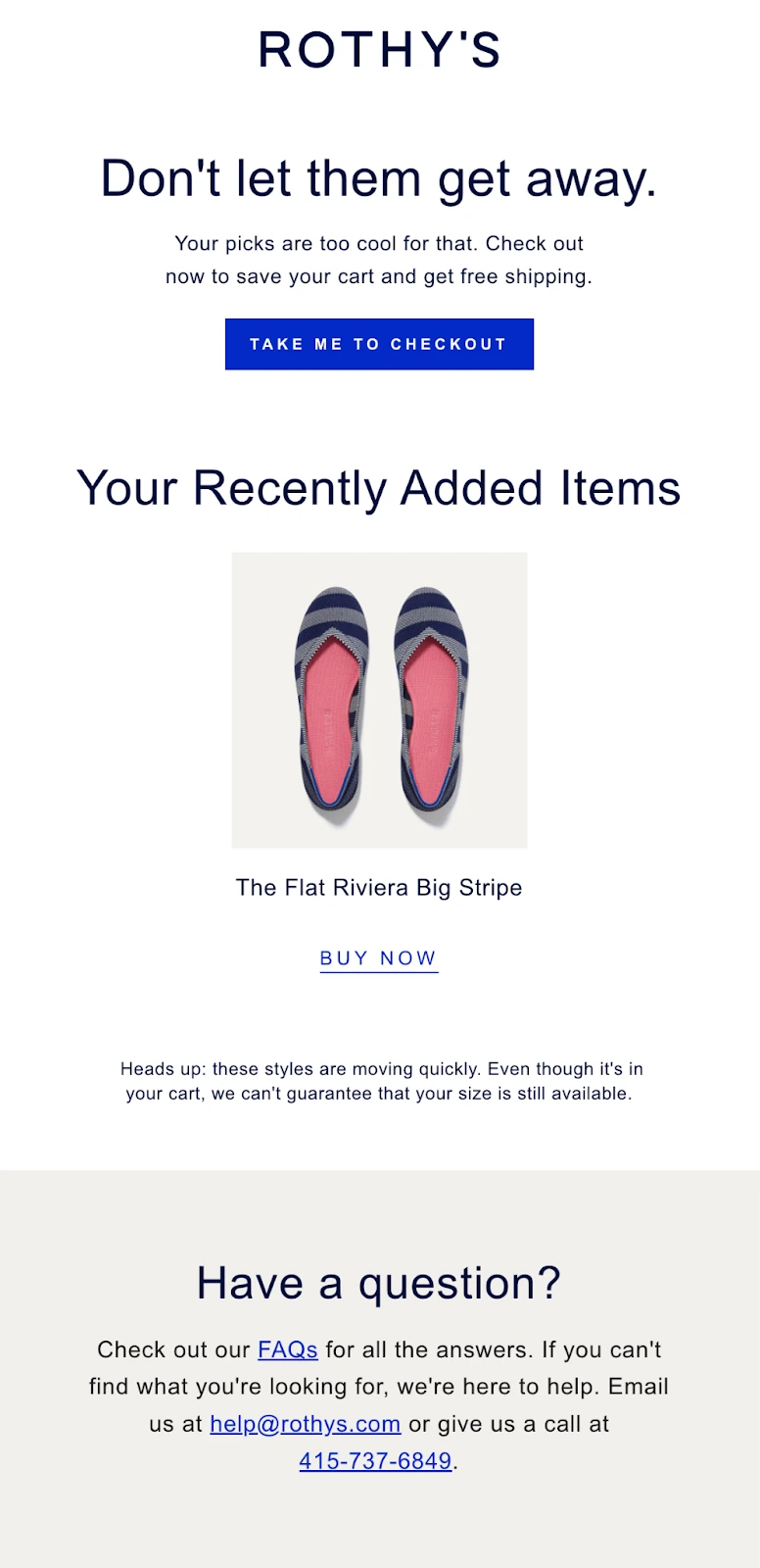
Rothy’s is known for its eco-friendly approach to fashion, using recycled materials to create stylish and comfortable shoes for women. In their browse abandonment emails, Rothy uses a simple and effective subject line: “Left something behind?” This subject line is intriguing and prompts the customer to open the email to find out what they left behind on the website. It also creates a sense of urgency and encourages the customer to take action.
The email itself includes an image of the abandoned product, as well as a personalized message that acknowledges the customer’s previous interaction with the product. Rothy’s also provides a clear call-to-action button, with a direct link to the product page to encourage the customer to complete their purchase.
One aspect that sets Rothy’s browse abandonment emails apart is their focus on sustainability. In addition to encouraging the customer to purchase the product they left behind, Rothy’s also highlights their eco-friendly practices and the benefits of choosing their products. This not only reinforces Rothy’s brand values but also appeals to customers who prioritize sustainability and ethical shopping.
Another effective strategy used by Rothy’s in their browse abandonment emails is the inclusion of customer reviews and social proof. This adds credibility to the product and may encourage customers who were hesitant to make a purchase initially to reconsider.
Lifesight Tip: Keep it clean, simple, and visually appealing
Final Word
We’ve taken you on a journey through the world of browse abandonment emails, showcasing the best examples and tips to help you transform those lost sales into successful conversions. Remember, the key lies in creating personalized, engaging, and visually appealing emails that speak to your customers and highlight your brand values.
By using engaging subject lines, personalized messages, and visually appealing content, brands can successfully re-engage customers and encourage them to complete their purchases. It’s also important for D2C brands to constantly research and experiment with new browse abandonment email strategies to stay ahead of the competition and keep their customers engaged.
You may also like
Essential resources for your success
